How to prototype an MVP of a wellness app: Balanced

Wellness industry
The health and wellness industry has been experiencing immense disruption due to advancements in technology. Today’s consumers are embracing wearable technologies and other activity-tracking products more than ever before. The omnipresence of the smartphone has spawned a massive market for mobile health and wellness apps.
Research
Carrying out a survey seemed to be the most effective and necessary to answer this question and then identify the pain points in people’s lives to determine the direction of our product, we’ve got 89 answers in total.
- 66% check every 15 minutes or more
- 78% check phone as soon as they wake up
- A majority gets encouraged by positive information as a mean to change
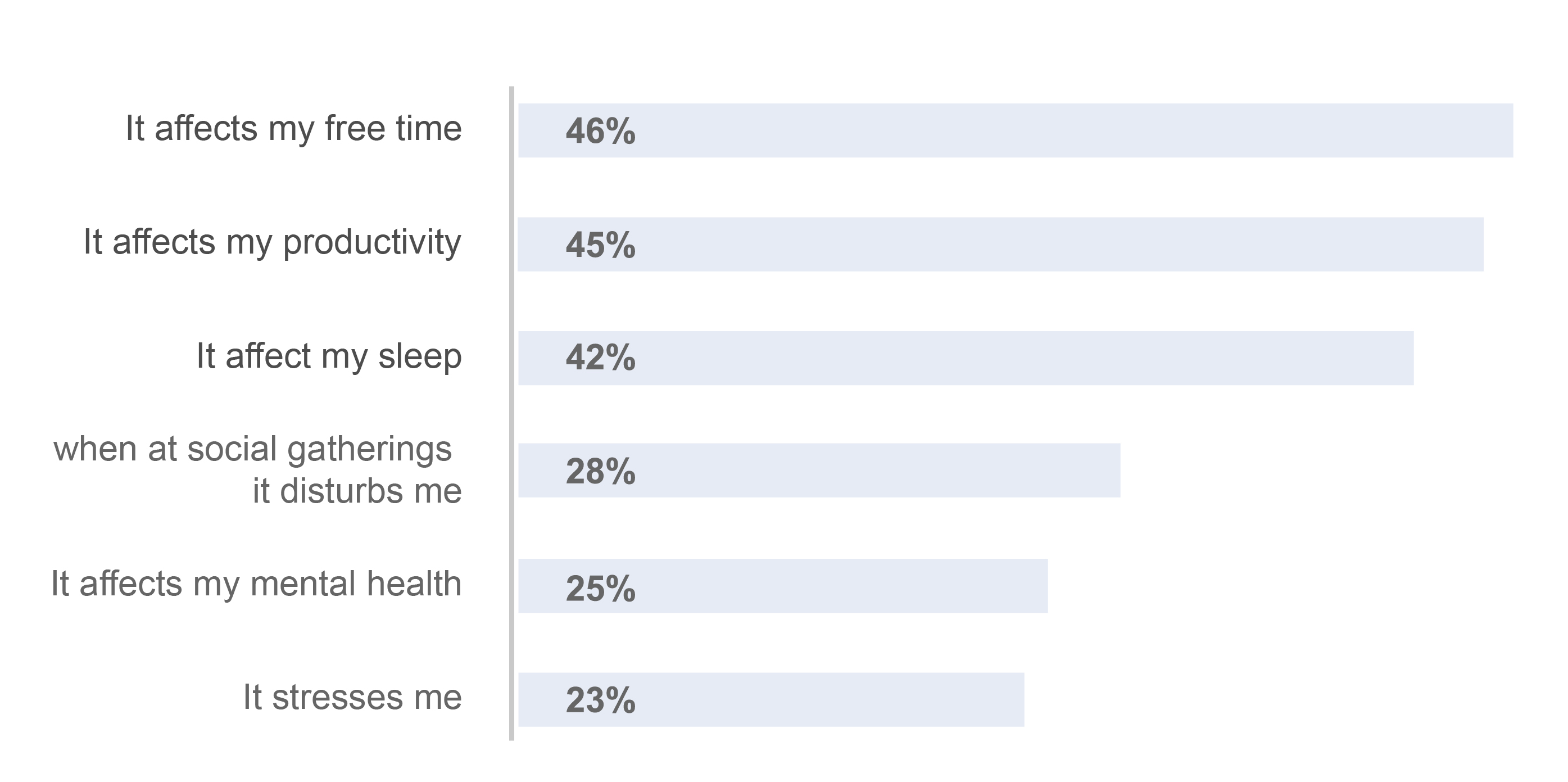
The histogram above shows us that the screen time disturbs our users more mainly on:
- their free time
- their productivity
- their sleep
We noticed some important quotes:
- “Screen time affects my mental health”
- “As I can’t do it on my own, I need help to change my habits”
- “I want to be able to entertain myself without my phone”
- “My last hour on my phone didn’t give me ANYTHING”
- “I don’t feel good about it, but we have no choice. I don’t have any solution, so it’s impossible”
"People want to Scroll less and Live more"
To dig deeper, we conducted 6 interviews in Job-to-be-done framework. We wanted to identify the actions that these people are trying to perform for their wellness,
to understand their contexts and the way that they use their phones, their feelings…
and then try on our side to the real problems of real people .
We learned that users want to feel less guilty and to learn how to use well their phones, to give them the feeling that they don’t waste their time and regain control of their phone and their lives.
Here are the insights:
- Statistics with comparisons: “21h on your phone: we know you’re a master chef–it’s the same as cooking 5 Michelin dinners!”
- Feel in control, empowered: “I don’t feel apathetic anymore!”
- A real friend: “Apple statistics makes me feel bad, I want to talk with a buddy”
- Smart stats: “See my activity at a glance”
- Win at life: “I spend my time well–I’m productive”
- Actionable help: “A flip off function that accessible”
Define
Problem Statement
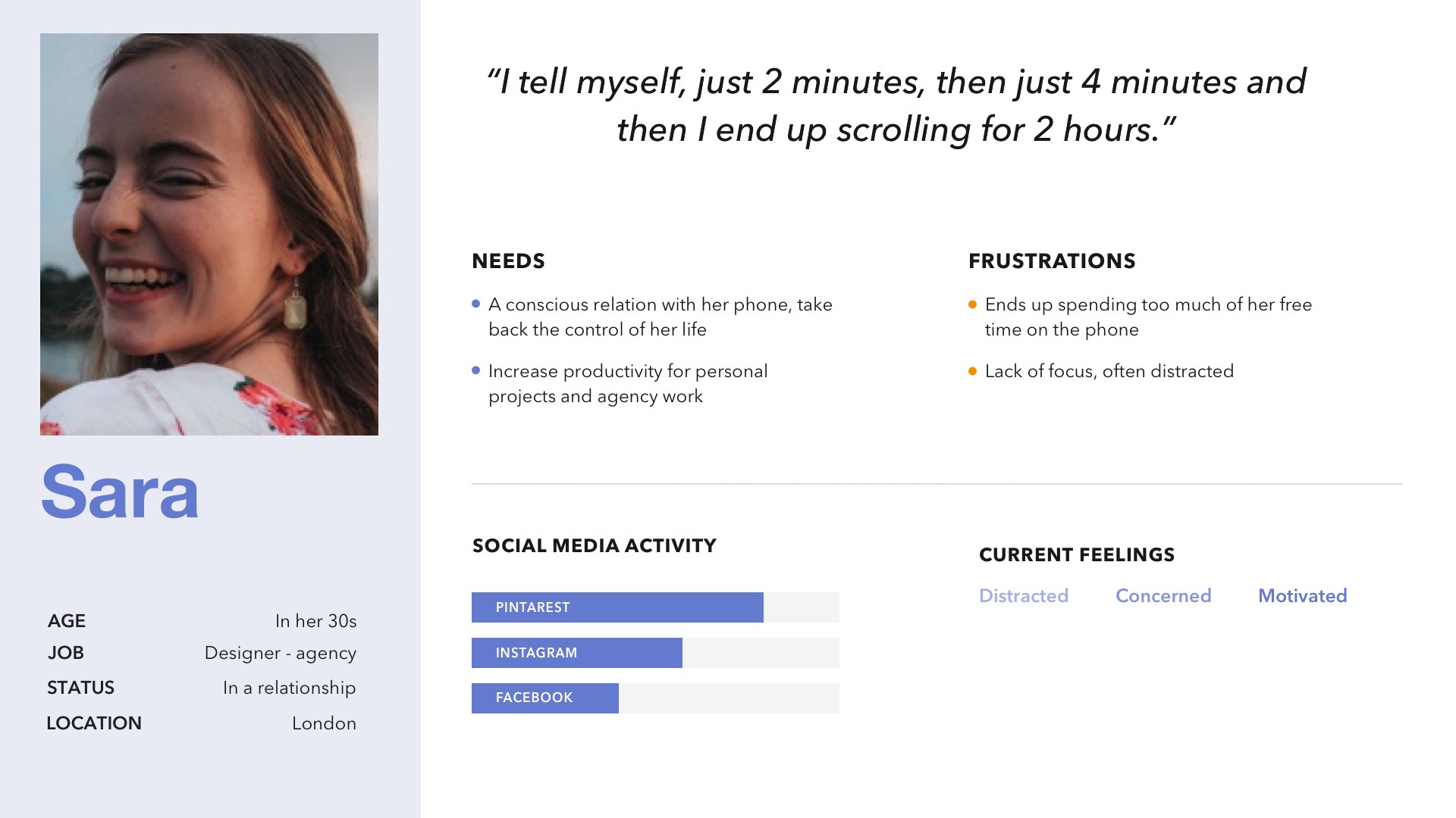
To stay focused on Sara needs, motivations and frustrations, we framed our problem statement:
Sara needs a solution to help her reduce screen time and reconnect to real life. She wants to be productive and sleep better. So she can take back control of her life, sharpen her focus, enjoy every minute of her free time and reduce stress.
Ideation
Below are Sara’s journey and her interactions with Balanced app. An overview of her typical day.

MVP
Now we’ve gotten to know better Sara and her habits, we have to generate a lot of ideas. To propose the best solution, we use different ideation tools:
- Worst idea: The concept is to write several bad, stupid, illegal ideas to come up with fresh, good ideas
- Round Robin: The concept of this tool is one person of the team starts to draw the idea and then, the next person continues to build it.
MoSCoW is a way to prioritize stories, features, tasks or requirements. That system makes you break all your features down into 4 categories.
1 - MUST-HAVE initiatives
The must-have features are crucial and are the core of Screen Life Balance. Those are necessary to create our concept. Without them, the app will not work:- Statistics: we know that Sara needs a way to track her behaviors: longest pick up of the day, how much she checks her time while working, the longest time she leaves the screen locked…She can also measure the time she spent on social media, her emails or text messages.
- Phone detox: we know that Sara needs a way to help switch off her phone with: the Flip function, set up sleep time, set up her first time to take her phone in the morning or at night. We also added a slow scrolling function to get Sara used to not doing it unconsciously.
- Motivational messages: we know that Sara needs to be encouraged when she doesn’t feel well. Sara will receive messages like: “Sara, you have scrolled 21km, it’s almost a half-marathon! What if you went out to run for real?”
- Dopamine boost: we know that Sara needs to be inspired, to get ideas for her free time: personalize preferences feature. Sara can receive all the recommendations according to her hobbies, her goals and next to her.
- Challenges: we know that Sara needs to celebrate life’s mindful moments, big and small and create challenges for herself or with her family and friends.
2 - SHOULD-HAVE initiatives
The Should-have features are important but not necessary for the first version of our app. We decided to keep only one but not in the full version:- Rewards: we know that Sara would like to have a reward when reaching goals
3 & 4 - COULD-HAVE (or Nice-to-Have) & WON'T HAVE
For the other features, we know that they are not necessary to develop our app, they can be “gadgets” for a future version.
Now we know all features that we must have and we want to organize them. We need architecture and structure so we built a site map.
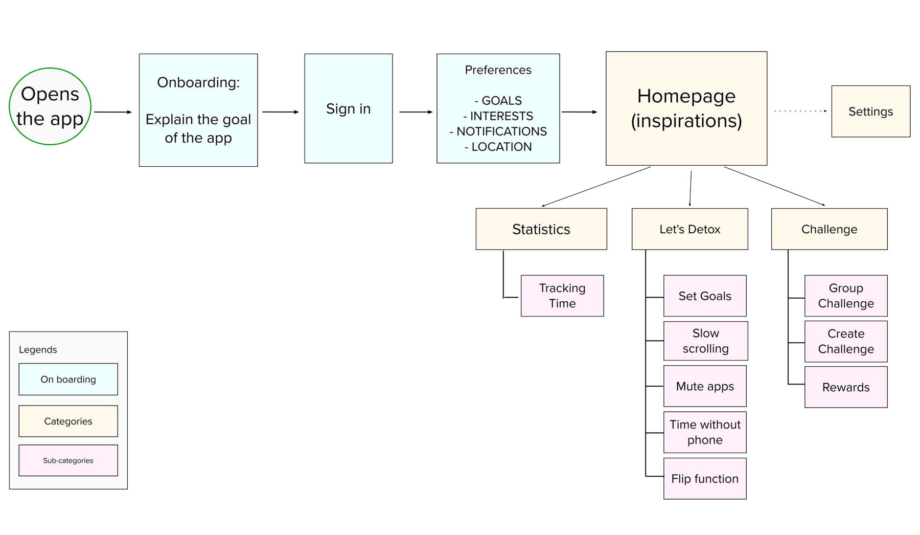
This sitemap shows you how the app will be composed, you can see the onboarding and the different steps to set preferences, this is important to have a personalized app for Sara; the homepage and his 3 main categories: statistics, let’s detox and challenge.
Prototyping & Usability testing
With all those elements, we started sketching, drawing our solutions and imagine the screens. Of course, our product can be perfect with a first shot! That’s why we conducted 6 usability tests to get lots of feedback and iterate. This will help us develop a prototype that has the kinks worked out of it.
Keypoints that we noted:
- Descriptions have to be improved
- Block sizes have to be reconsidered
- ‘Buddy feeling’ is tricky to channel in low-fi setting
Findings in numbers:
- 5/6 of users didn’t really understand the Flip function
- The wording is not enough clear, users think about food when they heard “Detox”
- 4/6 of users would like to skip location permission
- 6/6 of users love the slow scrolling function
- 6/6 or users like the playful part and the mood
User Interface Design
To provide our solution, we want to create an app that better suits our users. We want to bring a feeling of calm, inspiring, restful, and motivating.
To fit better with our values, which are:
Inspiring, calming, insightful & friendly
we created a moodboard, that will help us to know in which art direction we want to go and to stay aligned with our ideas.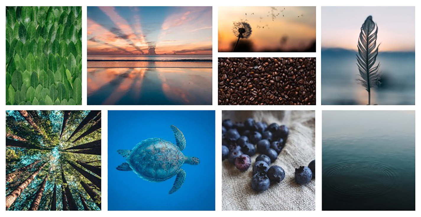
We picked up pictures that represent nature, lightness, zen with soft colors. We also created a logo, the aim was to build a brand that represents our values so we want to create a flat logo and simple, something rounded and light but strong because all our app will be light, so all our main identity will be based on this logo.
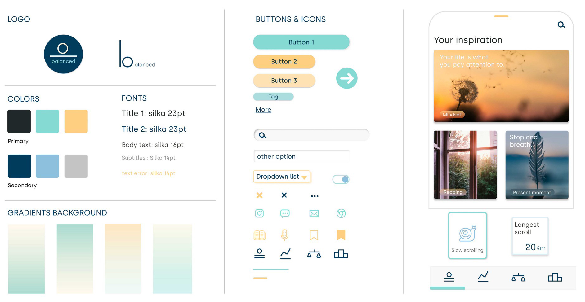
To bring a feeling of something calm and relaxing, we created a shade of light blue for the background. And to play with contrasts, our primary colors are solid with dark grey and light orange.
To feel more light and flat, all our icons are designed with outlines at 2.6pt, and our buttons are rounded at 5pt.
Now it’s time to see how into mid-fi we designed our hi-fi prototype:
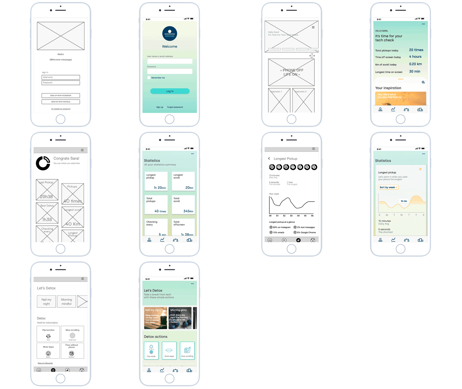
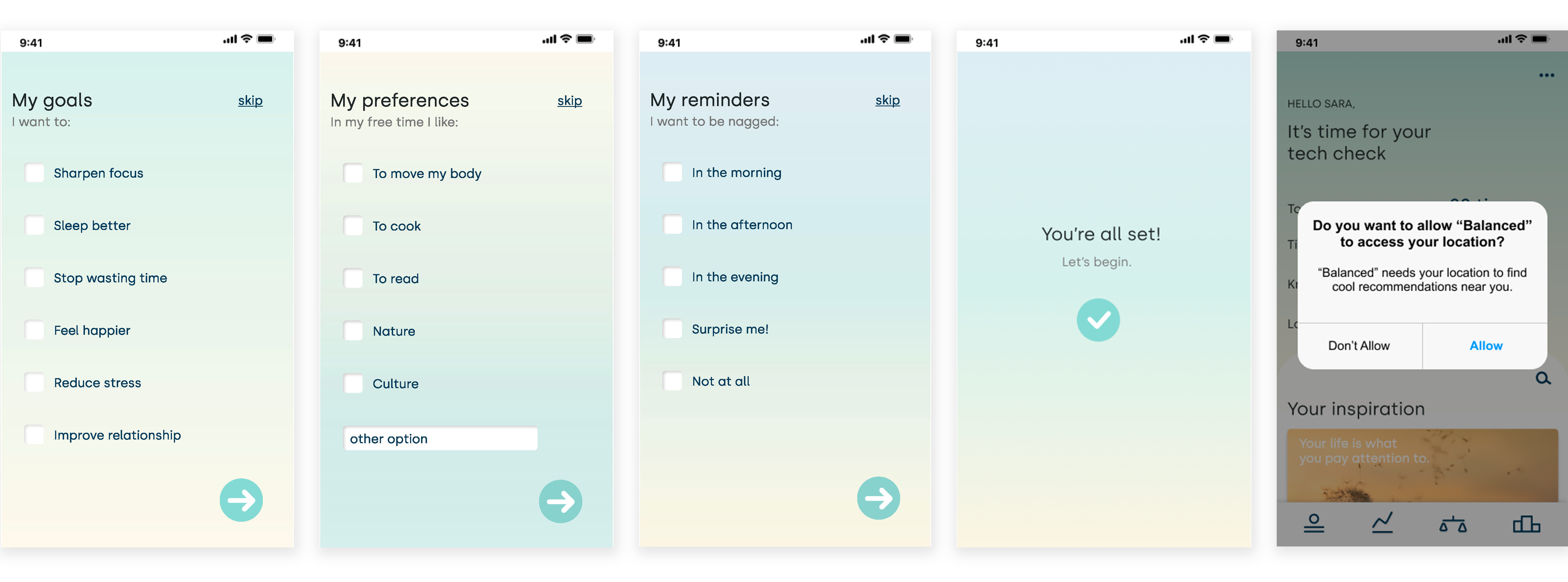
Onboarding
It is important to define the user’s preferences so that the app is personalized according to their wishes and objectives.
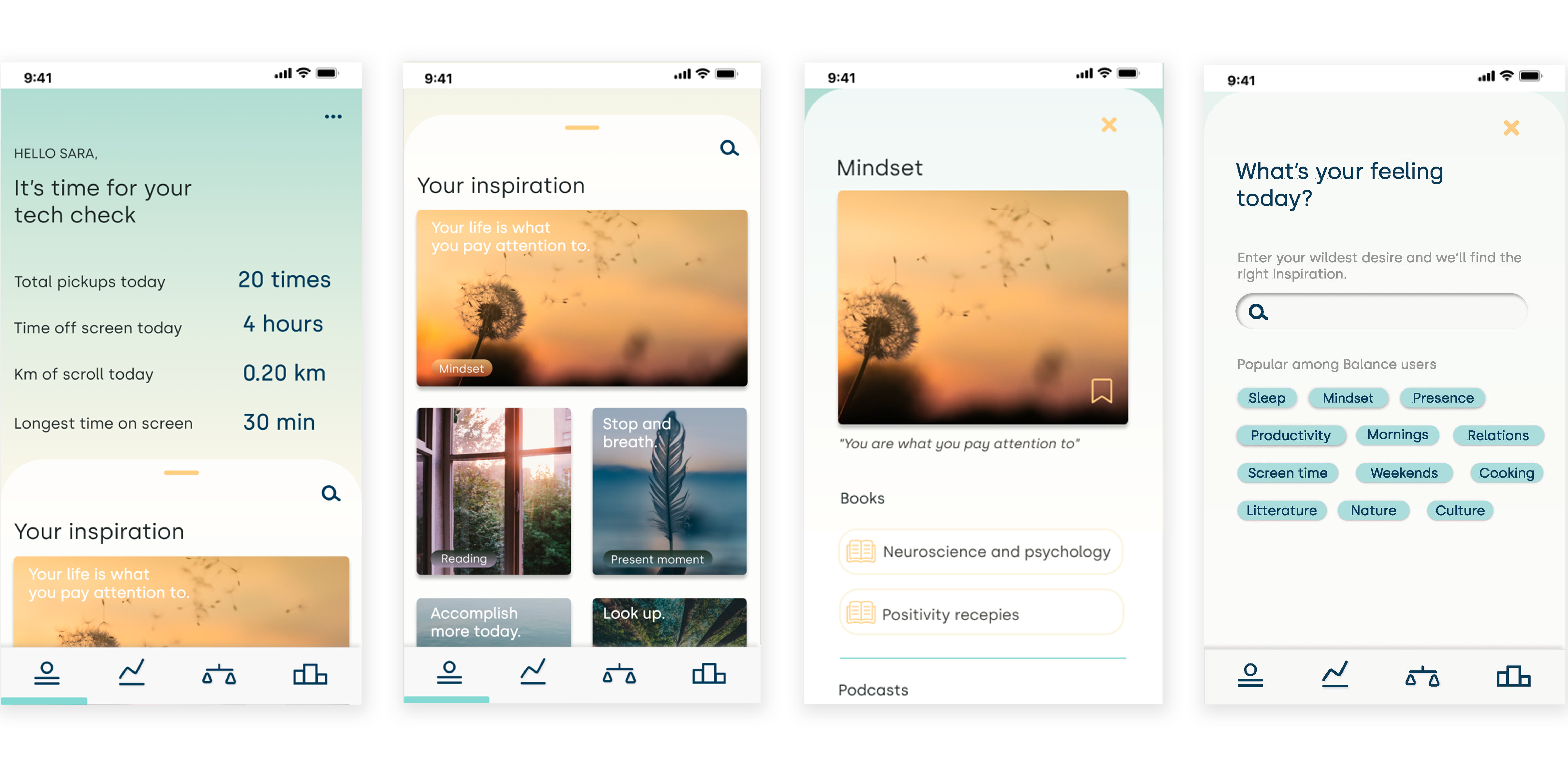
Homepage
On the homepage, the user can see his main statistics of the day and below his inspirations tips that he received. He can also look for other inspirations with the search bar and tags, but we decided to not add more than 10 pictures because our concept is to help users reduce their screentime.
Statistics page
The statistics page allows the user to check all his stats by category and in summary. He can see all the stats of the month and when he clicks on a category card, he can have the trend by day, by week, by month, and by year thanks to the dropdown list button.
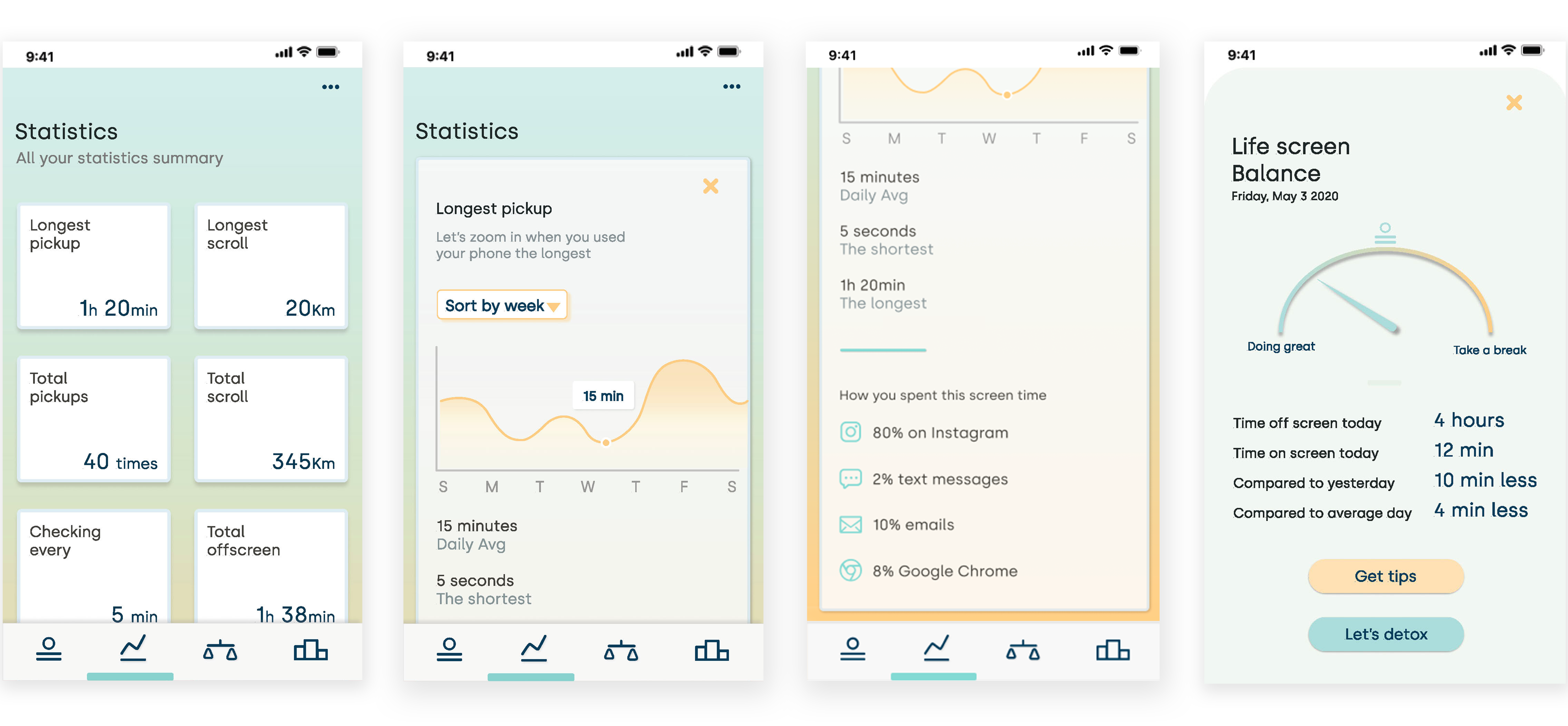
The detox page and challenge page
Those pages allow the user to set up all preferences about screen detox, to have notification tips or not, to set the flip function and the slow scrolling.
He can also participate in challenges about different topics with his friends and family and get rewards if he wins.
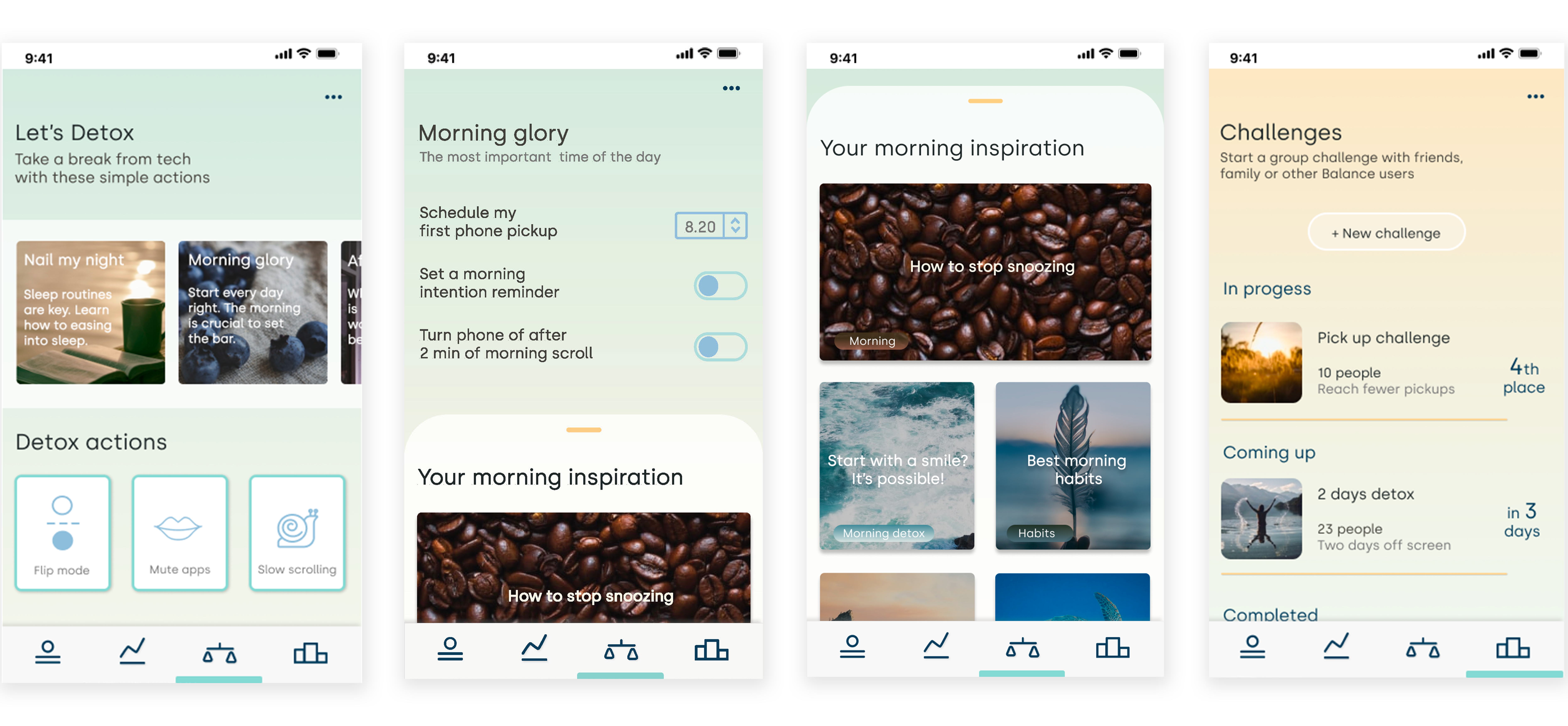
We have also added some micro-interactions to show how the app works with scrolling and dragging. Some elements are animated to help the user better see his progress.
You can watch the video below to see the demonstration:
Desirability test
To make sure that our app fits with our brand value, we conducted some desirability testing with users. We asked them to give us 5 words when they saw our app, this corresponds to the first 5 seconds of their feeling.
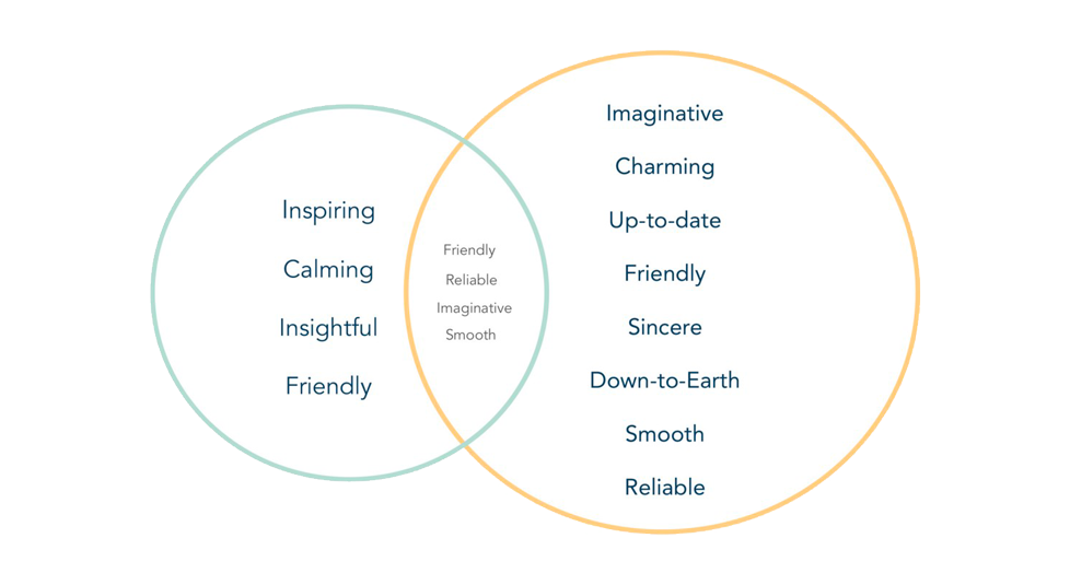
You can see that the words conform to our brand attributes and that we can continue. But we also know that it can seem too calm or too zen and not readable enough at times. We wanted to evoke something airy and light that we hesitate to play with bold fonts. But for there to be enough contrast and readability it may be necessary to make a concession because it is essential that it please our users but above all that it is accessible and usable.
Key learnings & next steps
We learned that during our tests, our application still required quite a few actions to understand it, especially on the Detox and Challenges page and also for the tips.
Perhaps, for the moment we have to simplify it and create an informative page and an active page separately. We will, therefore, have to review the information hierarchy as well as the roadmap to simplify.
We also noted that the “buddy feeling” was not yet reached, why not add a real character like a bot to retain this attention?
To go further in our concept of “less screen time & less scrolling”, we also plan to design our entire application without scrolling but it is still to be tested.
Our next step will, therefore, be to improve all these points and thus conduct other usability and desirability tests.
We also want to go further on the rewards part and create partnerships in relation to our concept.