How can we help users to find information more efficiently and to improve the cart page?
Capsule d’Artiste
It is an arty surprise box dedicated to the curious and art lovers! Created in limited edition, these boxes offer to present an artist with inside:
- 1 numbered reproduction signed by the artist
- A surprise
- A fanzine
Their mission: To make discover artists differently by proposing a quarterly subscription or the possibility of buying a Capsule separately. My mission here is to convert more visitors into buyers by optimizing the website & keeping their strong brand identity.
What do users want?
After conduct surveys to understand what users want and need and what are their main goals, we had 62 answers and we know that users want to:
- Discover new artists
- Participating in artistic events
- Know artistic news
- Get to know artists in depth
More research
We want to increase sales and have more subscriptions so we need to understand what are users blockers and why they don’t go until the end. So we conduct interviews with some of our targets with guerilla-style & observation.
- 100% love the concept
- 80% like the identity
- “simple but classy”
but also:
- 52% feel the C.T.A. too engaging
- The majority would like to see more pictures & more descriptions of the Capsules.
- They think that the text is very dense sometimes and didn’t understand directly the information.
We had noticed some quotes and verbatim:
“Capsules are not highlighted enough, but I love the concept, it’s cool!”
“There is not enough information on the pages “I subscribe” and “I offer it” I want to know directly what I’m buying”
“When I buy art, it’s often for a crush, an artist I love, it is too risky for me to subscribe”
“The artists are not put forward enough”
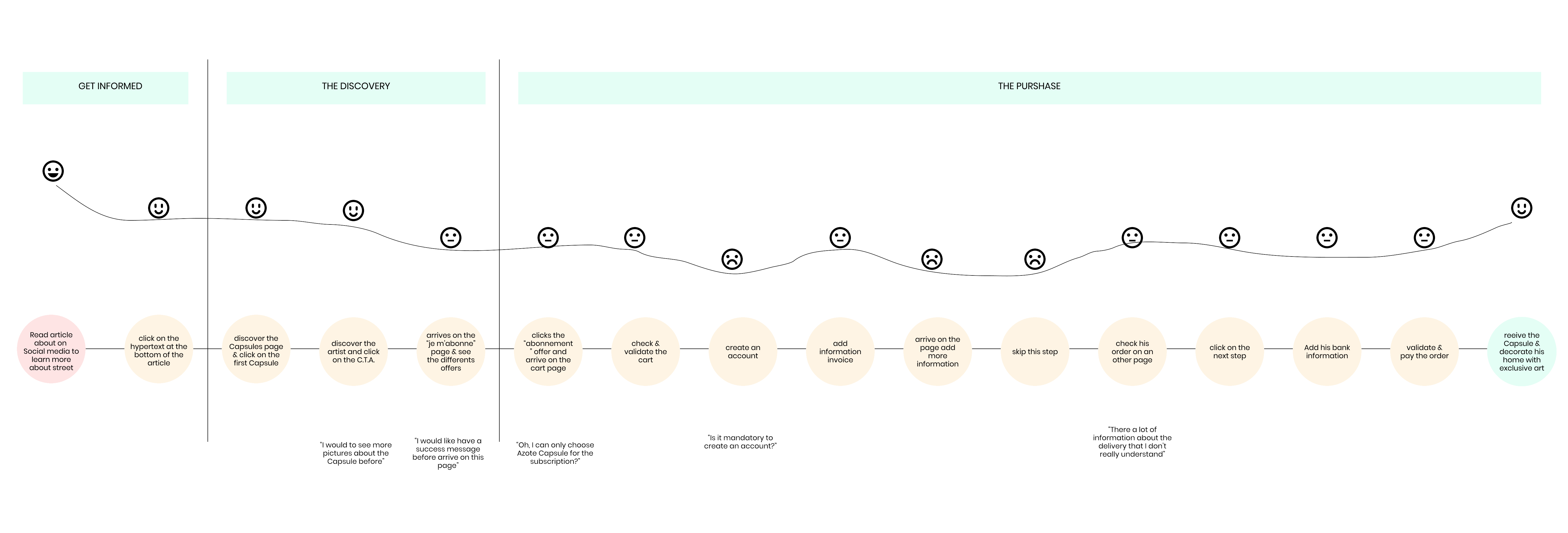
User Journey “As is…”
To better understand the concept of Capsule d'Artiste and how people access their website, we also asked users how they got to know Capsule d'Artiste. Generally, it is word of mouth, during exhibitions or openings or otherwise on an article shared on social networks.
It is from the last reason that we will focus on social networks and the article page of the website.
We will, therefore, ask ourselves how from this page we can help the user to discover the conceptand to encourage him to subscribe to discover more artists.
The User journey below will help us guide and also discover other design opportunities:
Our strategies:
- Simplify readability
- Simplify navigation & basket page
- Highlight the key elements
Define
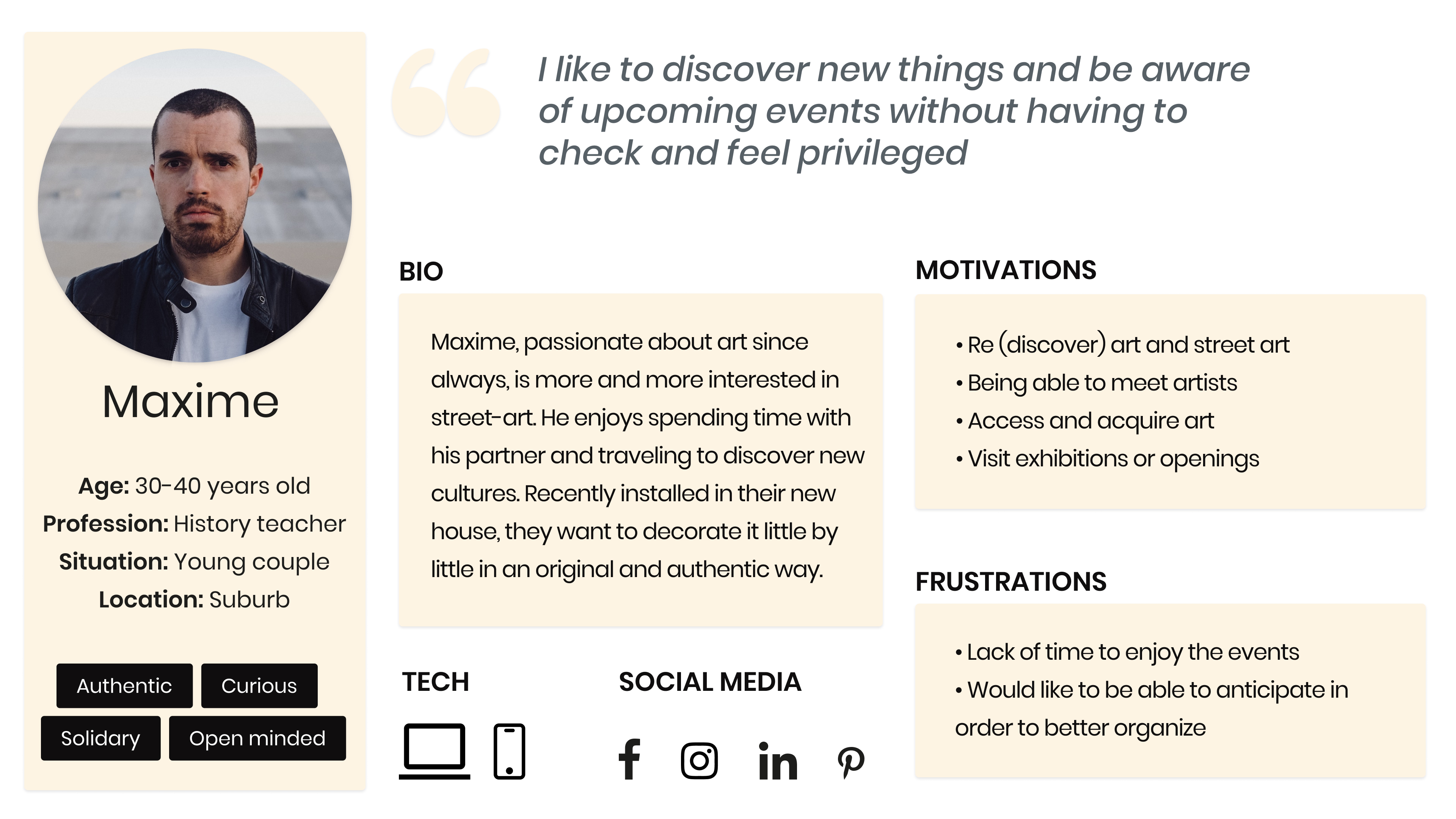
In order to better target our users and stay aligned with the client on the solutions we would like to provide, we have created a persona
Problem Statement
"Maxime needs to be better guided by finding information related to content, purchase and subscription to Capsules more easily. In addition, a better understanding of his order progression can help him finalize his experience."
Ideation
To have a more creative solution, we conducted ideation session, the Crazy 8’s, this method consists of drawing a total of 8 solutions, more or less crazy in 1 minute for each solution, and we noted those ideas:
- Create a visual of Capsule’s content to explain better what is the concept
- Create a new theme according to the artist of the moment on the website
- Put real artist into Capsule but it seems a little bit too crazy…
More ideas...
To have more ideas and more solutions we did more research with several competitors and we like:
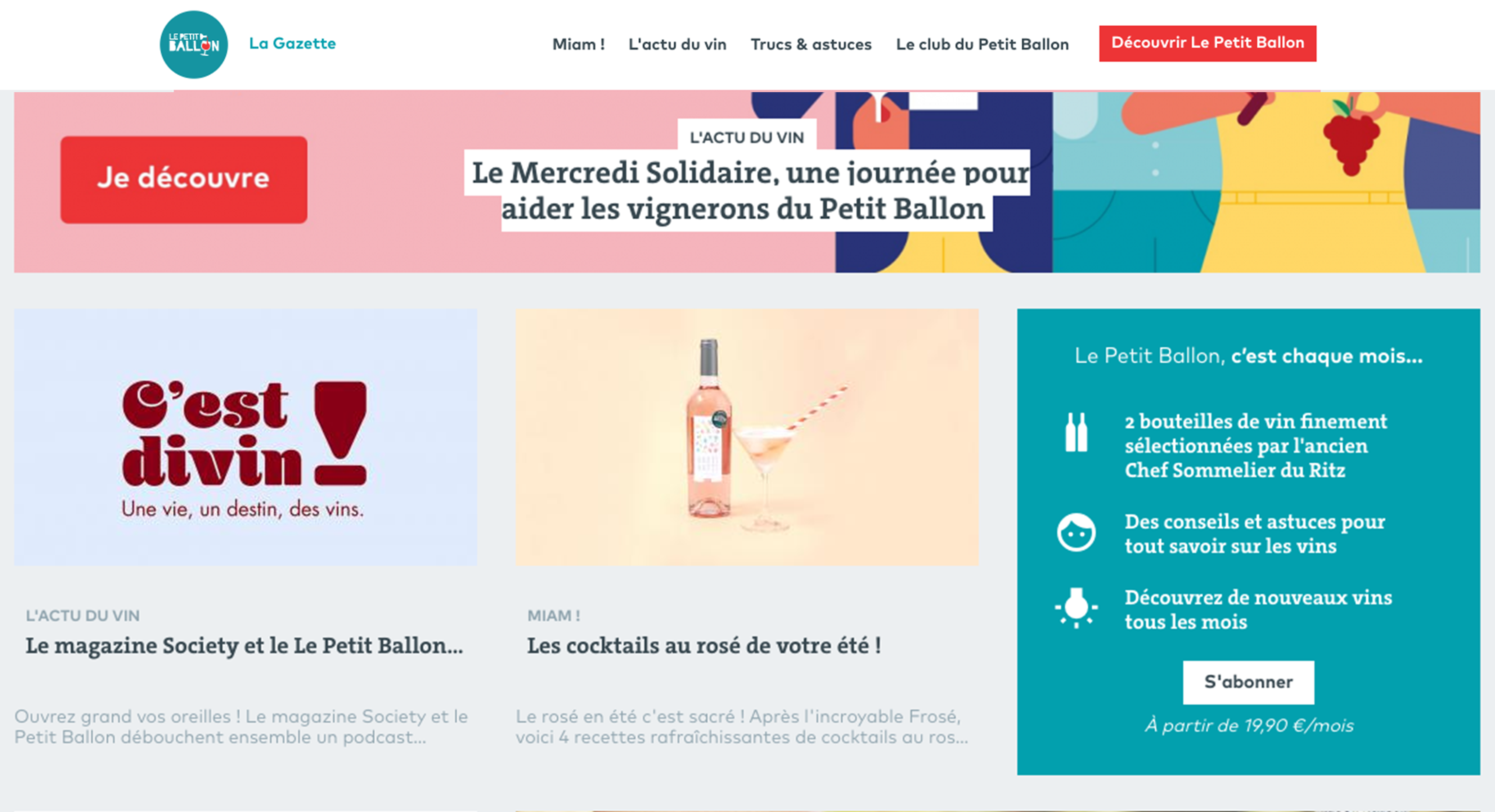
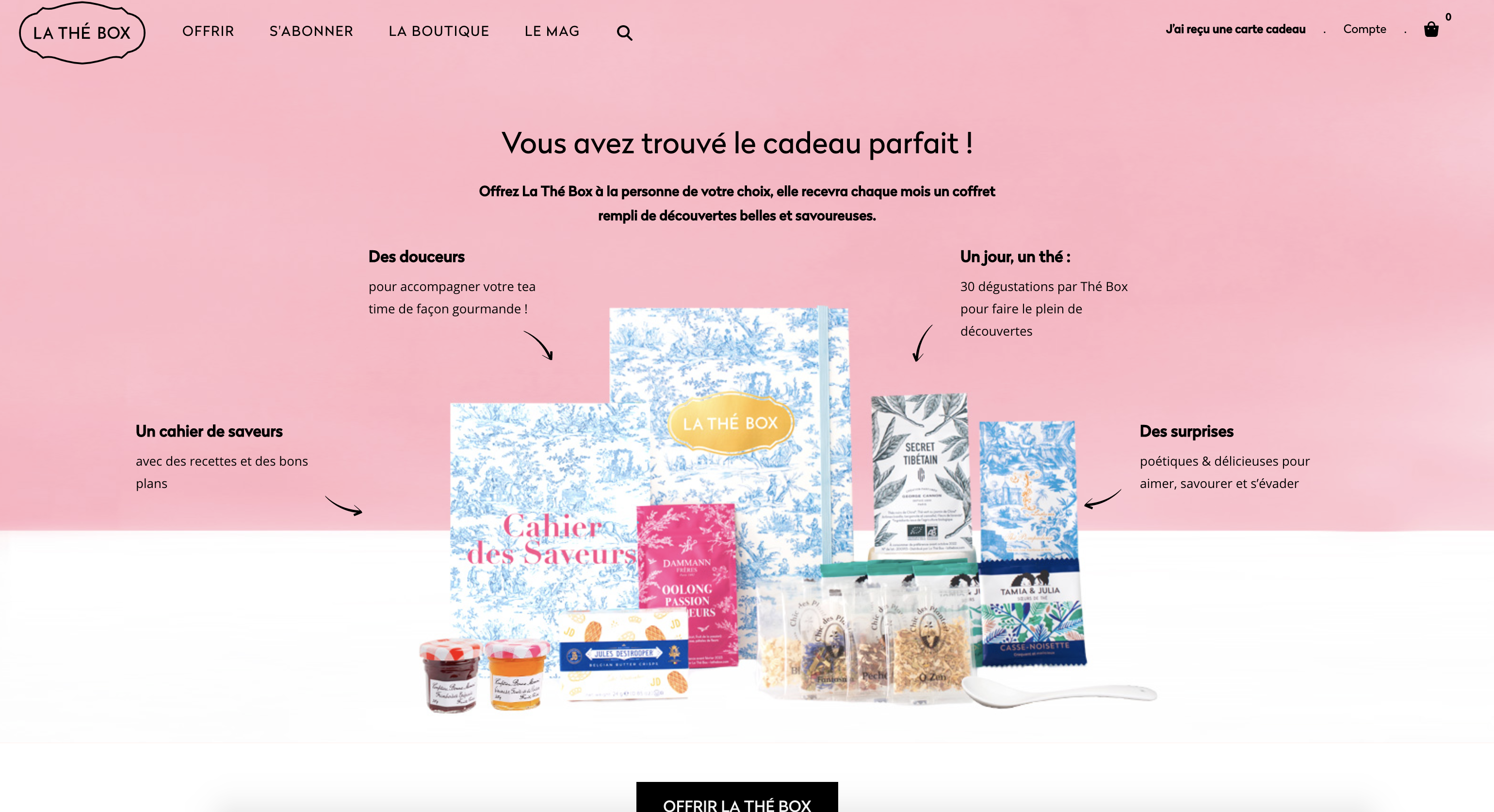
Le Petit Ballon & La Thé Box: We like the idea of how they show their concept on the blog page and also thanks to a visual that sum up the content of the box.
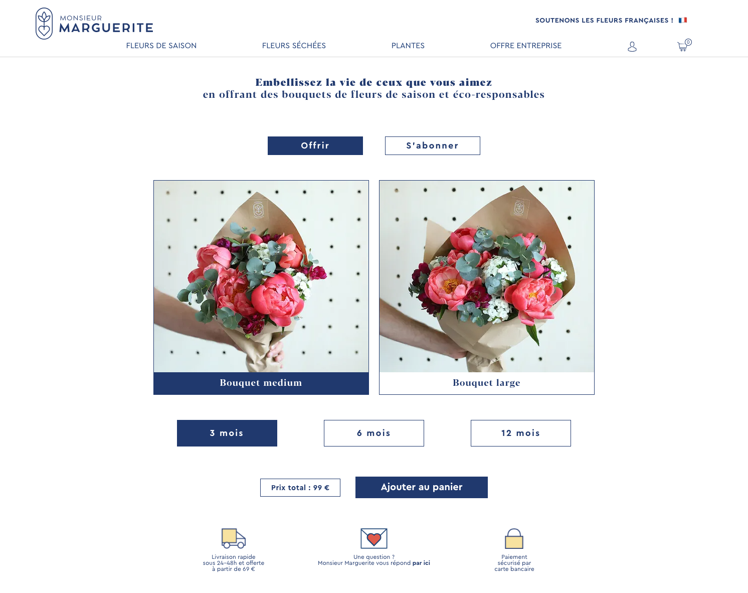
Monsieur Marguerite: we like the way that users can switch easily and quickly if they want to buy or to offer a product.
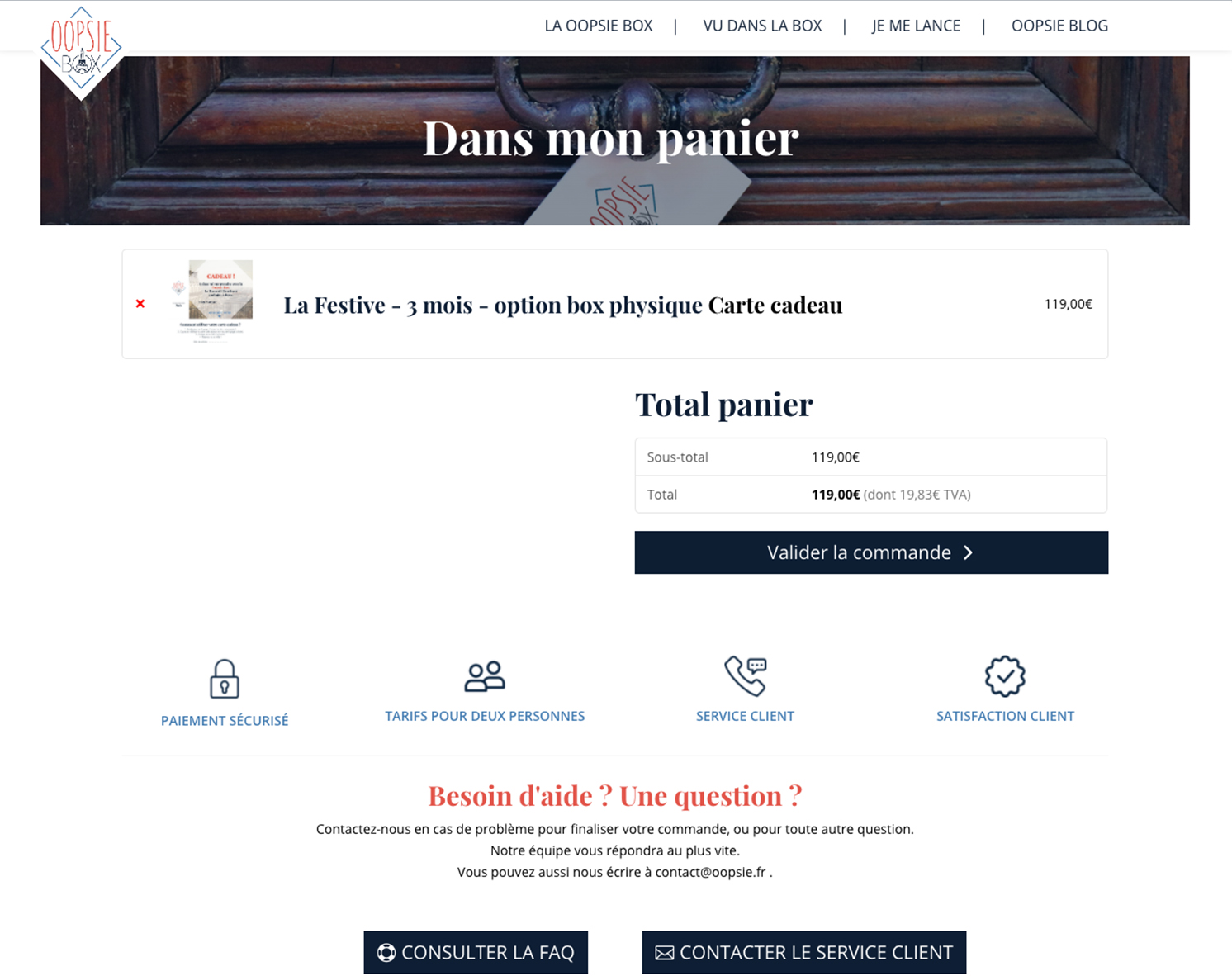
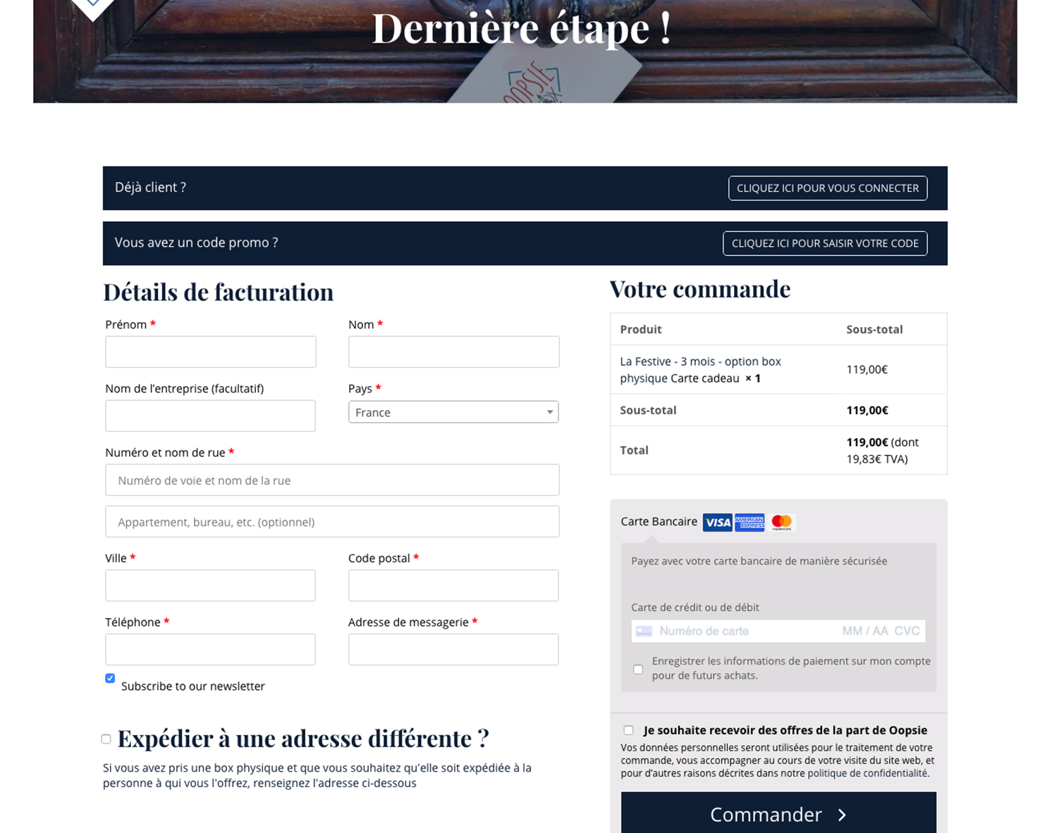
Oopsie box: We like the way that it is easy to buy a product in two steps, the overview that users have during all the process:
Sitemap
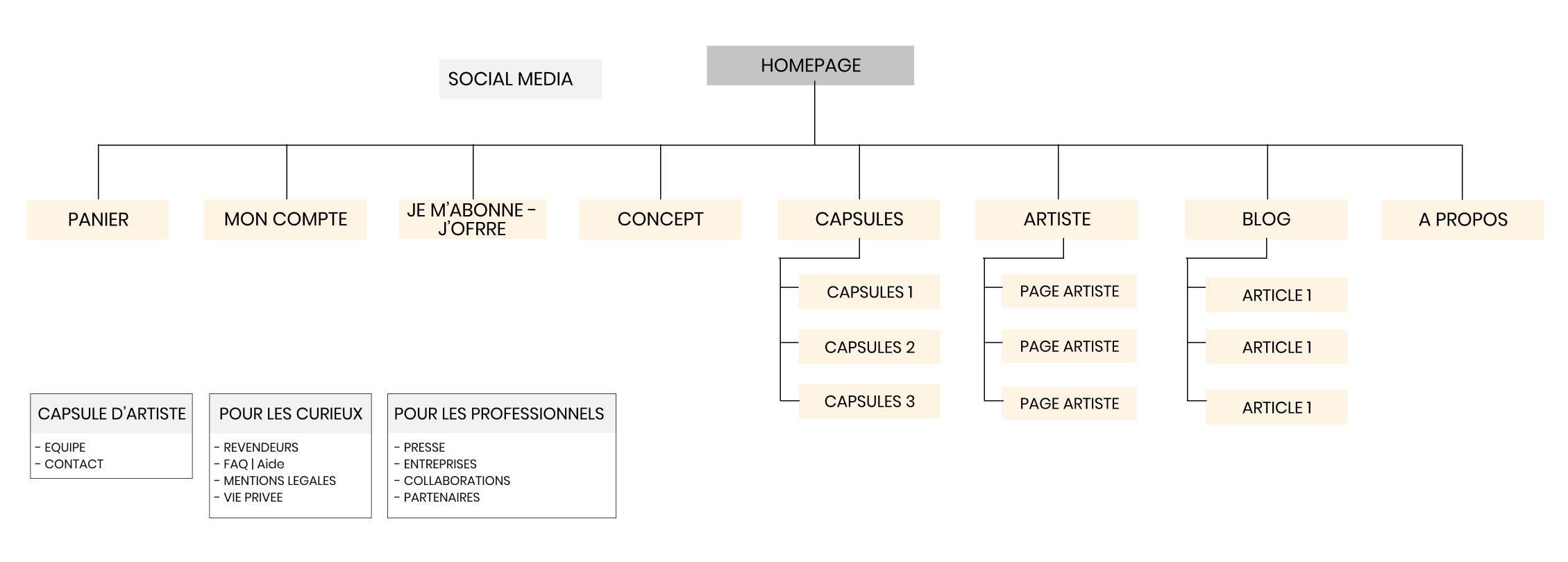
After all research, we have taken into account the verbatim of our users that they would like to see more the highlights of the artists, we reorganized the sitemap and add information that users want to find. We added on the navbar the page “artiste” and merge together “je m’abonne/j’offre” so users can have an overview of the offers and switch easier.
Userflow
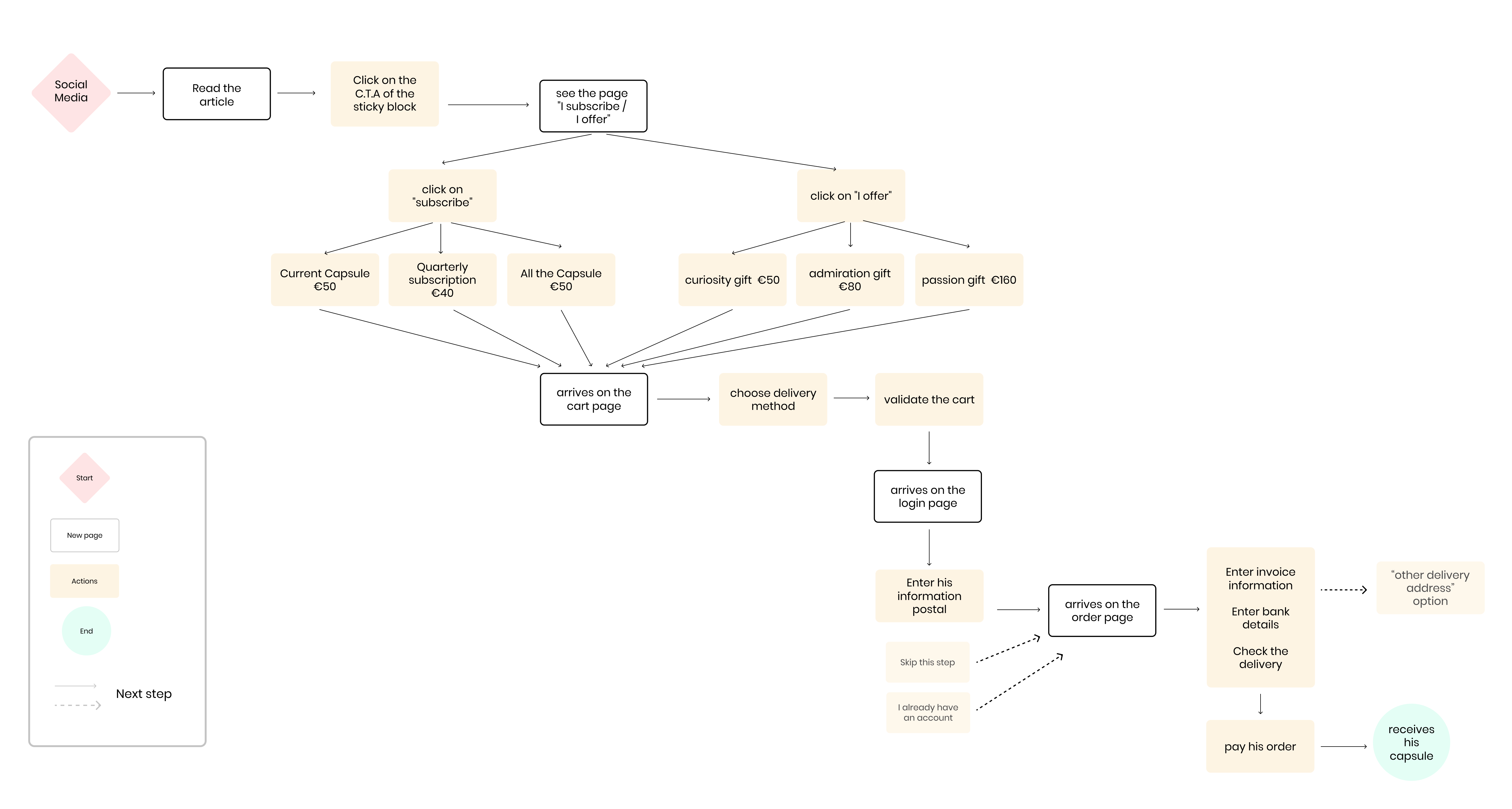
We start the userflow from the social network page, on the article page the user can see a sticky block with the concept of the Capsule and have a Call-to-Action to subscribe or offer if he wants. We also simplify the payment page with two steps before order.
Sketching & Wireframing
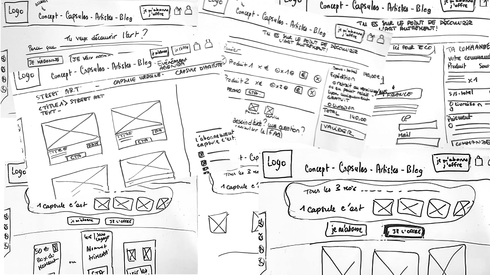
We made a long time sketching and wireframing to find how we can optimize and guide users into the basket page and to order a Capsule. Try to simplify the wording and different offers and options that exist.
Mid-fi prototype & User Stories
1. The navbar
“As Maxime, I want to find easily the artists so that I can know who am I supported”


So we added the “Artist” page and highlighted the button “je m’abonne/j’offre” and merge the pages together. We also added the page “à propos” if users want to find more information about the concept and Capsule d’Artiste.
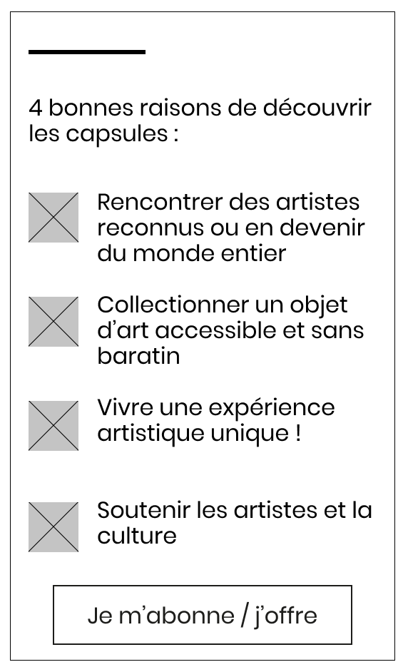
2. the sticky block
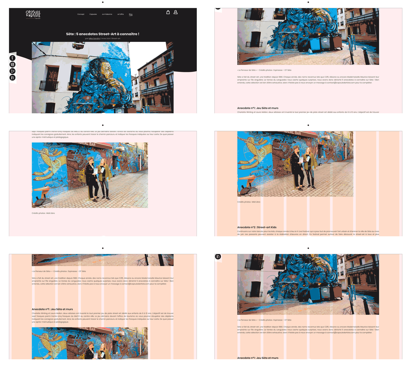
On the current article page, we can see that article takes all width of the page. The page works with 8 columns and we want to implement well the sticky block, so we need to reorganize the page.
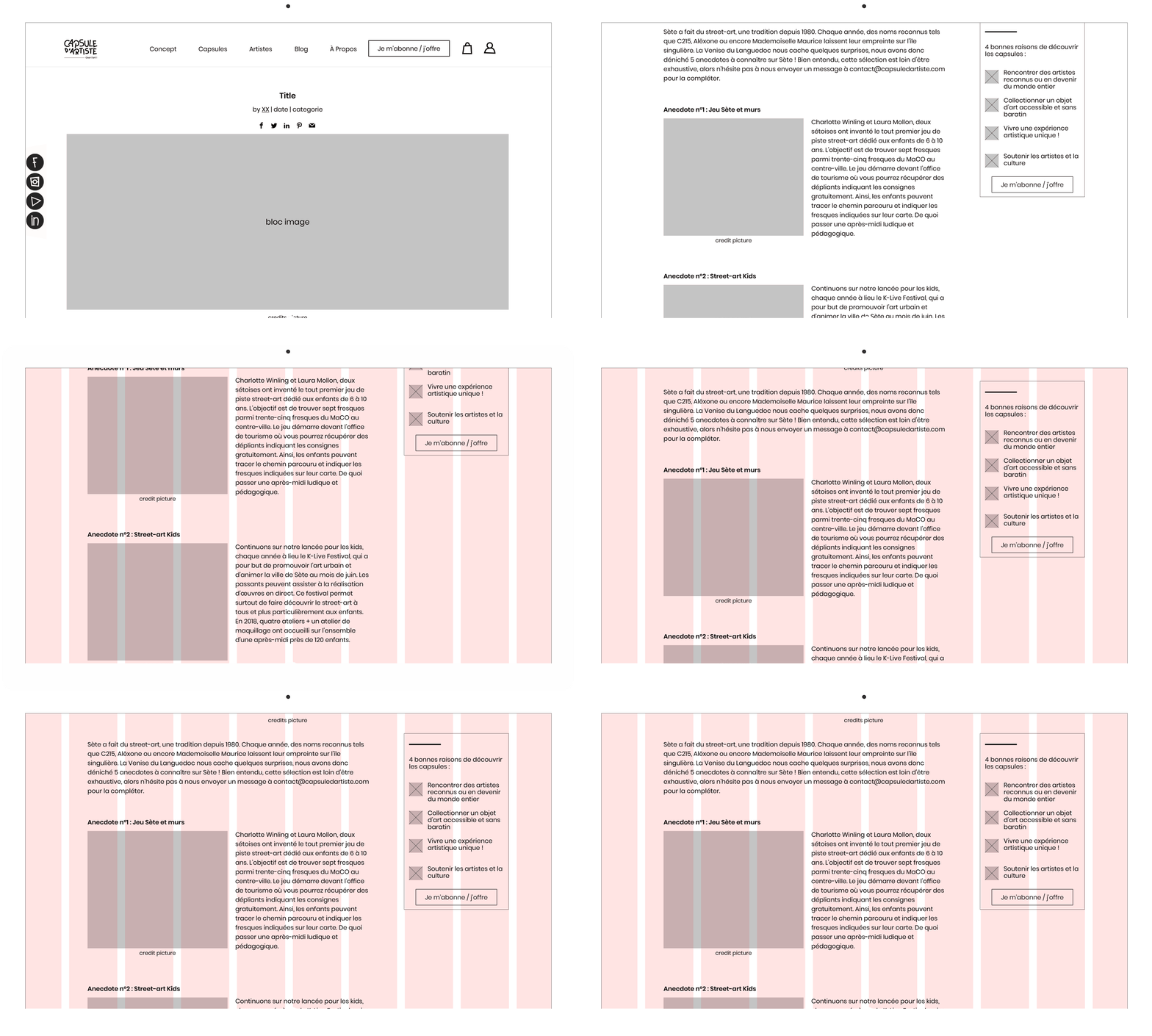
We created a page with 10 columns and reduce the width of the article. Pictures & texts are side by side and the sticky block on the right.
• “je m’abonne/j’offre” page
“As Maxime, I want to know what is the concept of the capsule so that I want to buy or subscribe to enlarge my art collection”
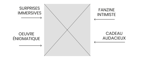
We want to create a visual that sum up the content of the Capsule to catch the eyes of Maxime, so he can understand quickly what it talks about.
“As Maxime, I want to know what are the different offers, so that it helps me make a choice”
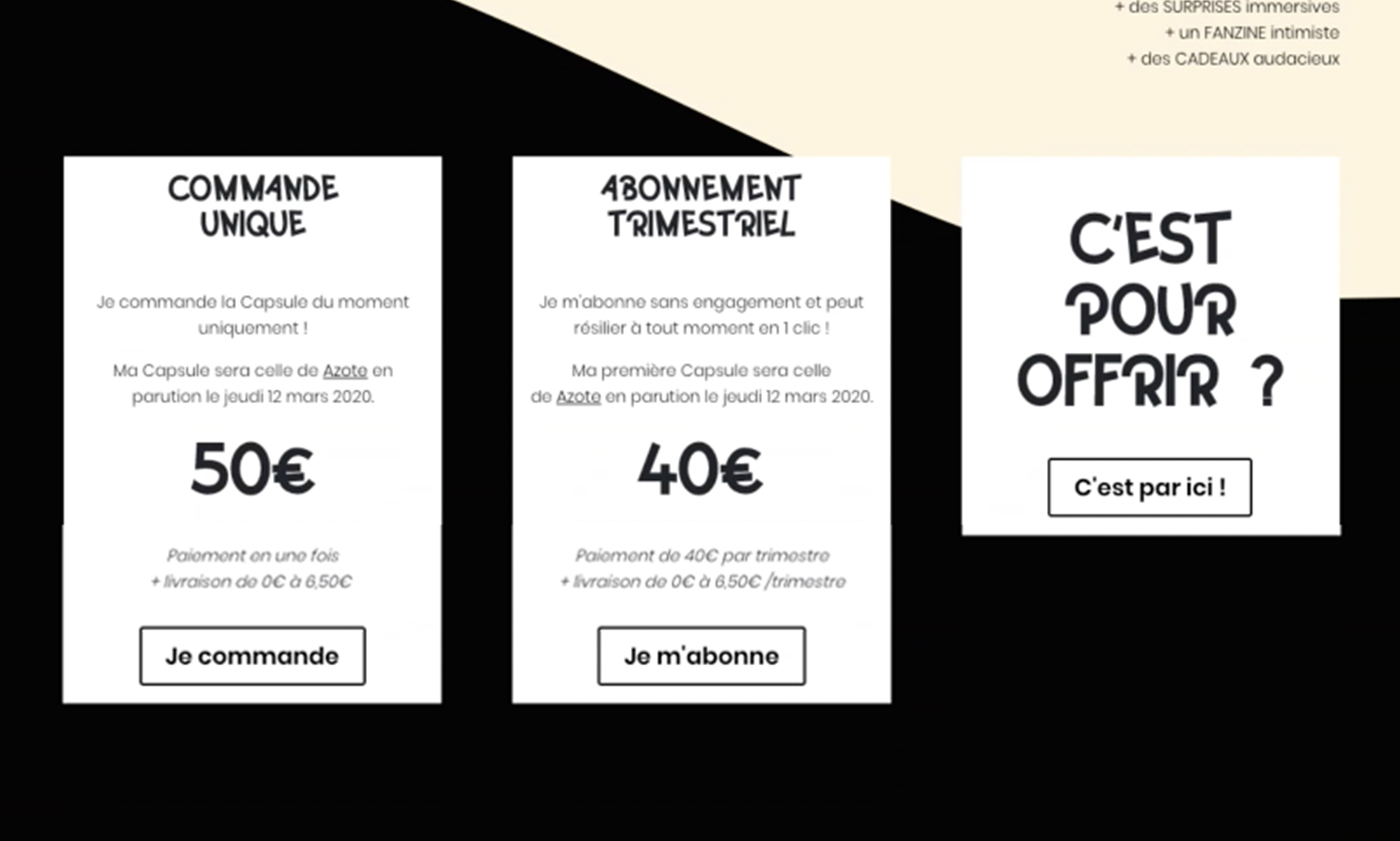
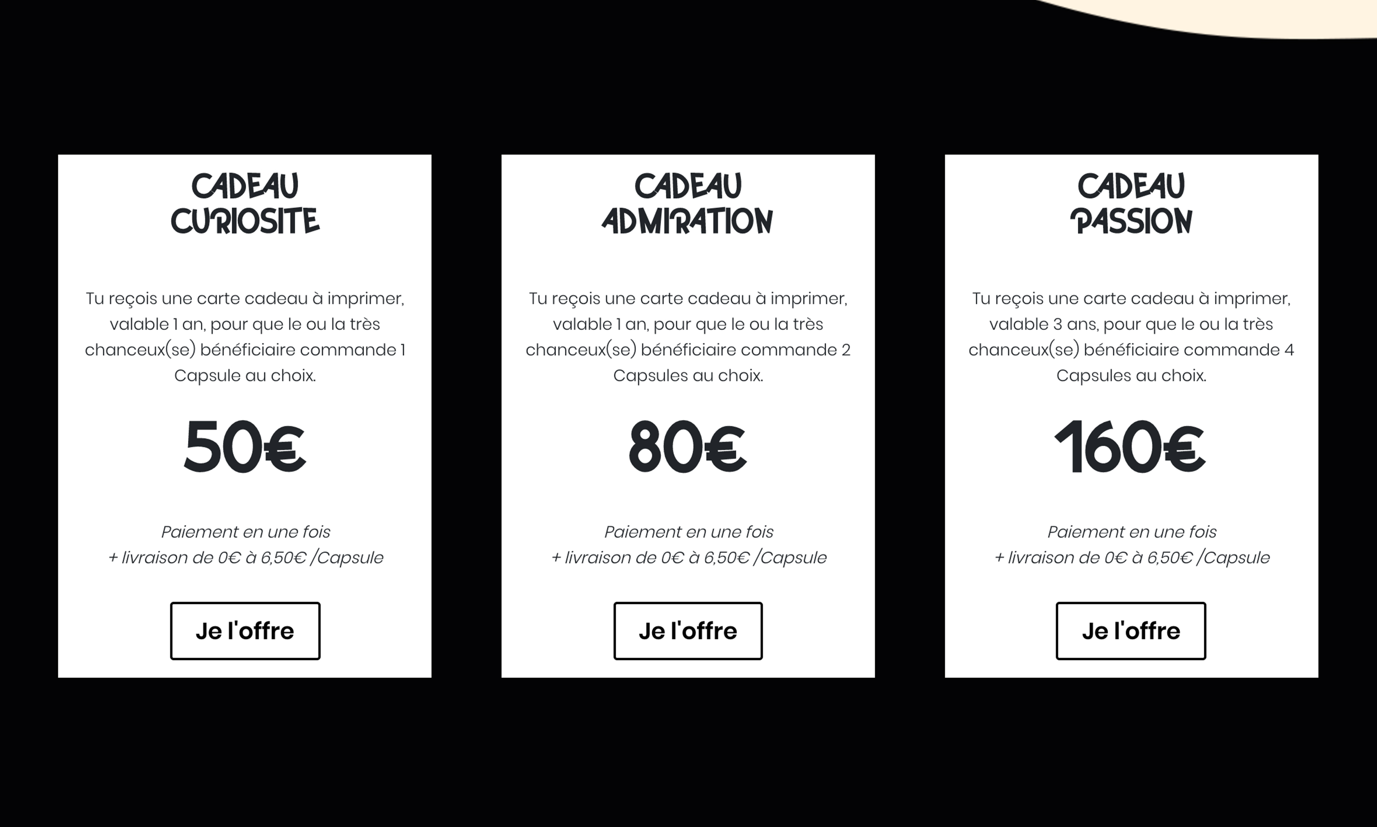
On the current pages, the different offers are separated and the prices are visible, but what it consists of is not clear enough. So we wanted to highlight the content by adding visuals and put less emphasis on the price to give Maxime a better experience and make them feel less “attacked”.
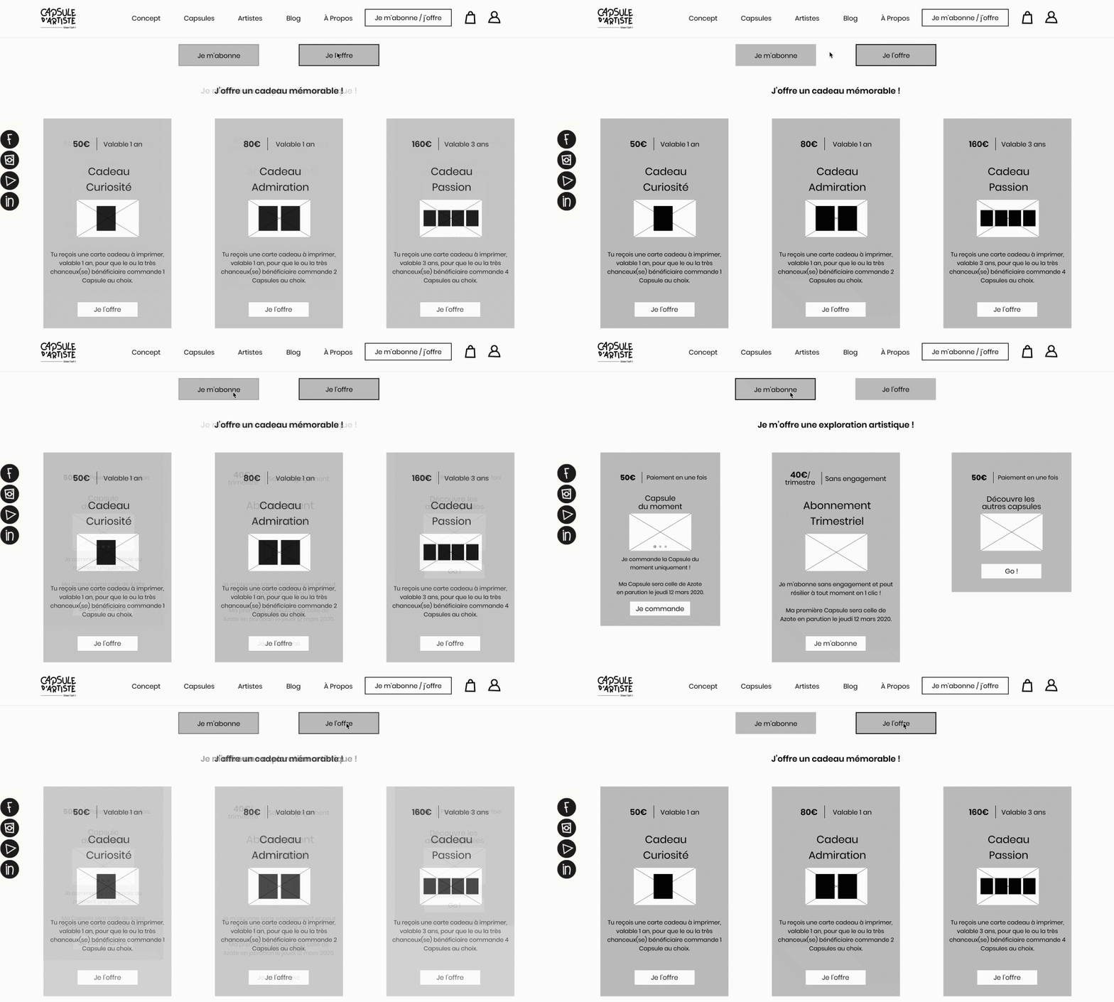
We also added two C.T.A. to switch easily and quickly the view of the offers, so Maxime can choose what he wants to do more naturally.
• “cart/order” page
“As Maxime, I want to order quickly and understand the informations so I can pay without hesitation”
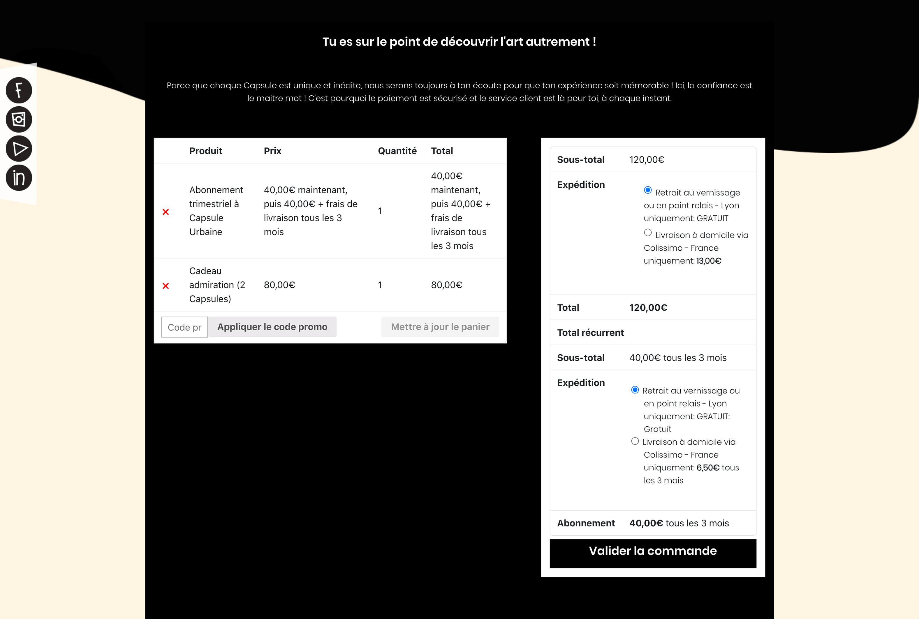
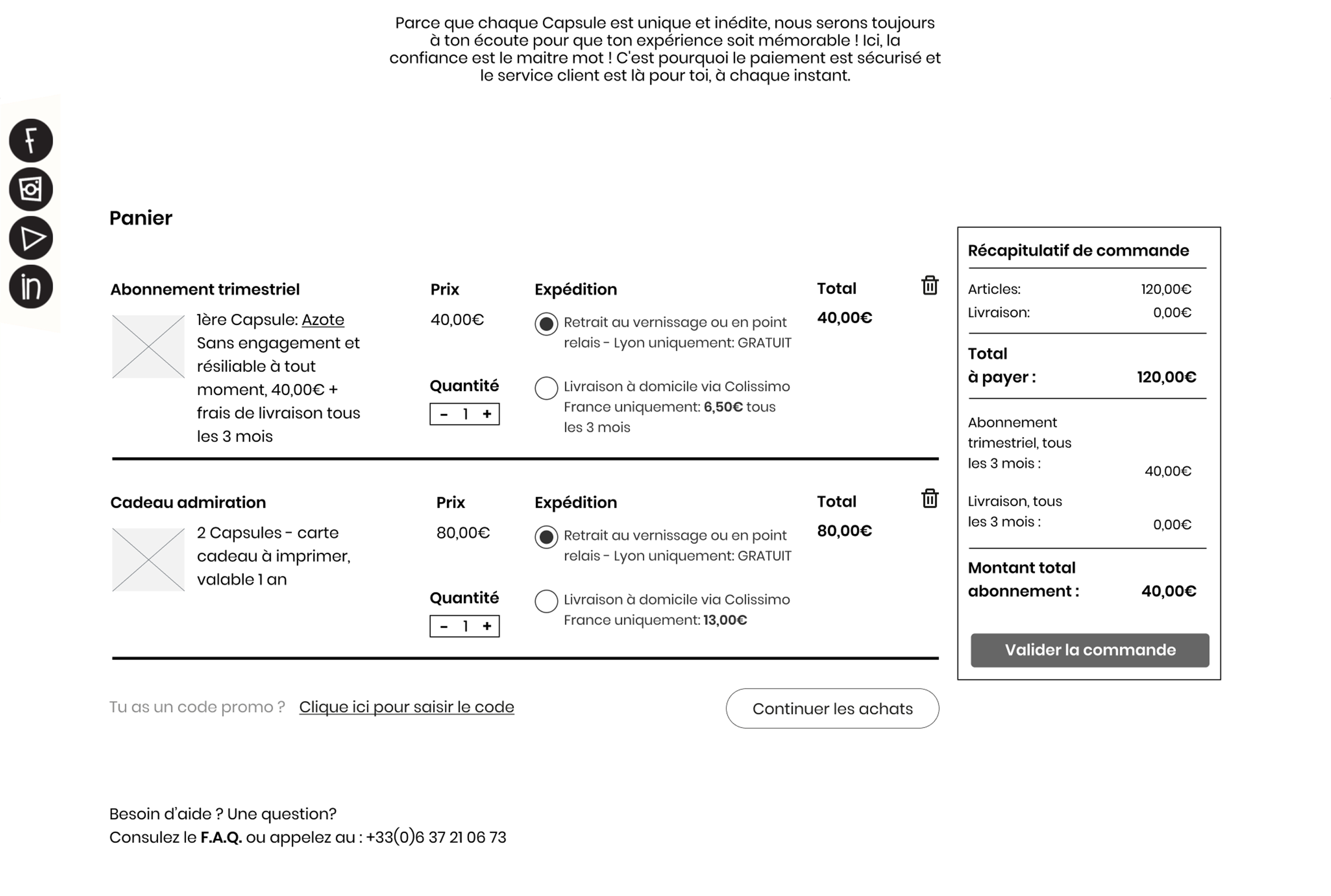
A simple modification can change everything … in order to better guide Maxime, we have reorganized the information on this page.
Firstly, we decided to add an image of the product to the basket, so Maxime easily remembers what he added. Secondly, we have added clear details of what each product contained such as “cancelable subscription at any time”, “transport costs to be paid each time we receive a new capsule”, “gift card to print” as well as its validity.It reassures Maxime in what he buys and clarifies his purchases.
In addition, we added an option to be able to simply switch the delivery mode with radius buttons, so Maxime can see if he was wrong or not and can modify if he wishes.
On the right we have an overview of the basket, so Maxime knows what he has to pay now and the subscription amount for each quarter.
We have also added a C.T.A. to invite him to continue his purchases but also the possibility of helping him if necessary, it reassures and comforts him in his purchases.
• Validation & connexion
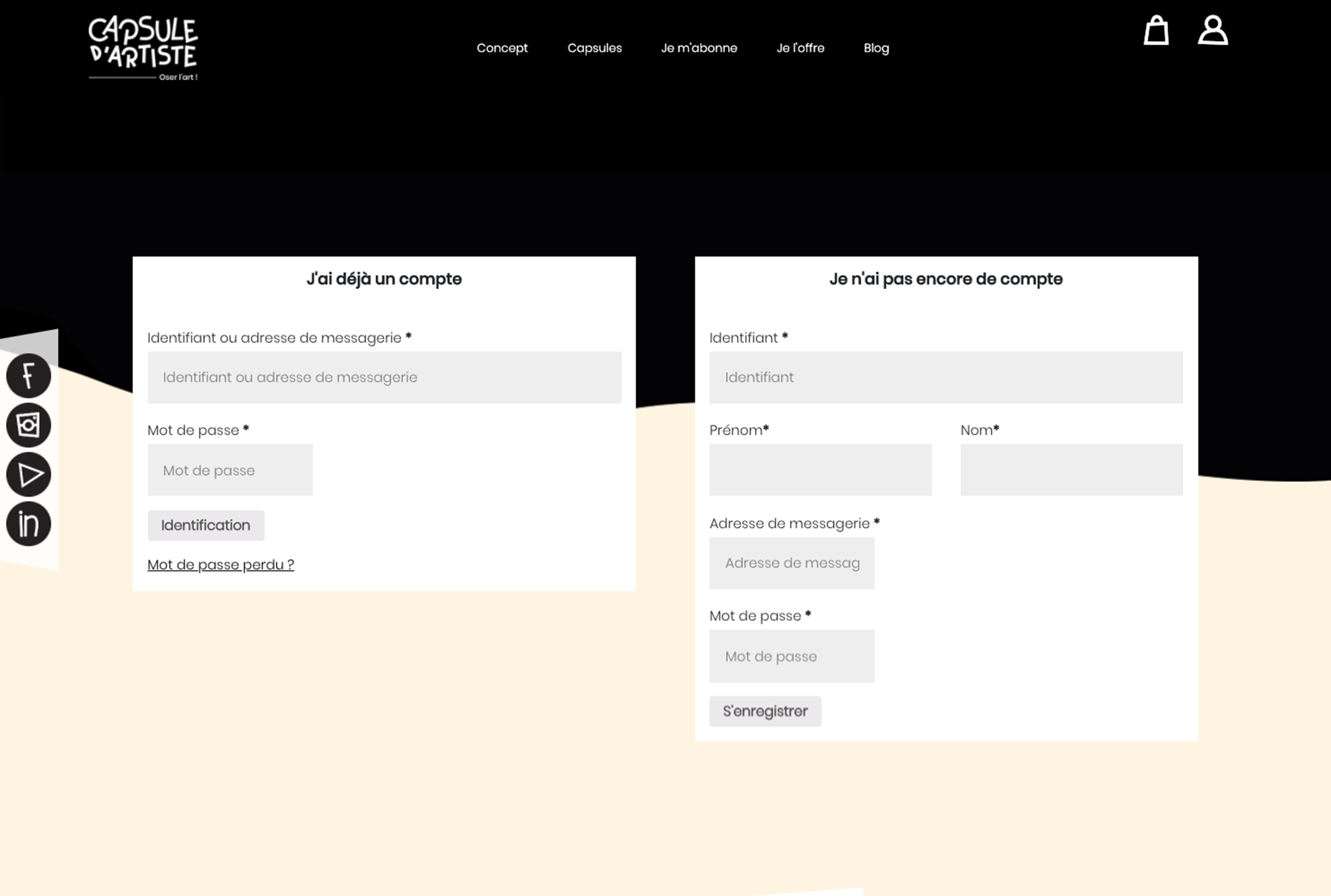
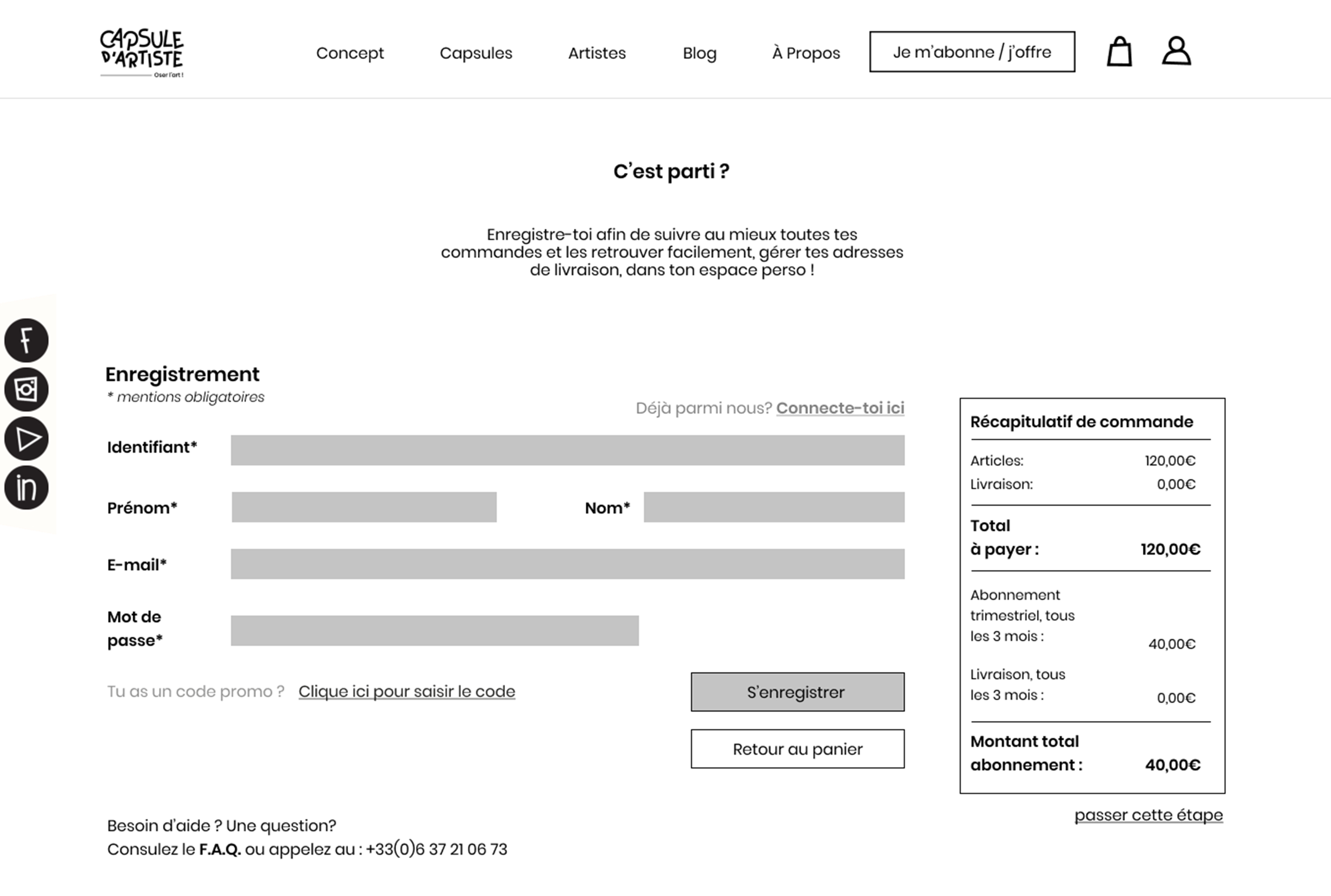
an account. We proposed an option to be able to switch this step so that Maxime can easily do his shopping without having to commit.
• Order
To simplify the order, we reduce all the steps that Maxime has to do before pay.
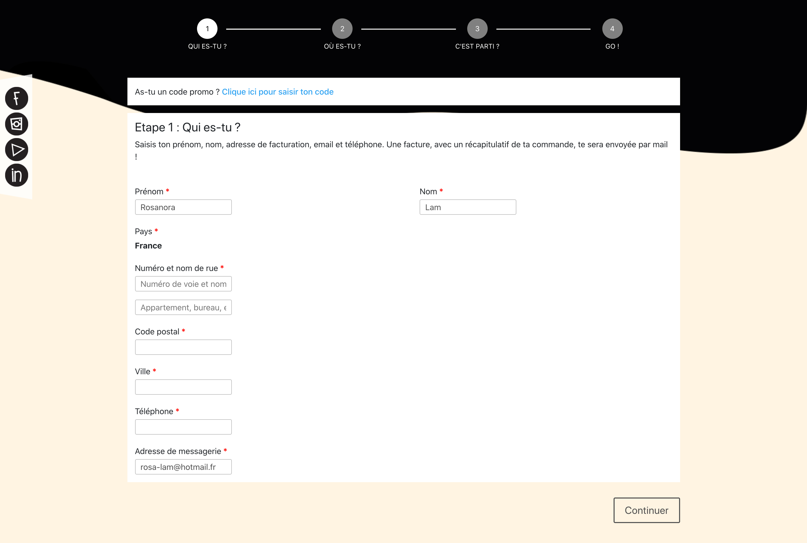
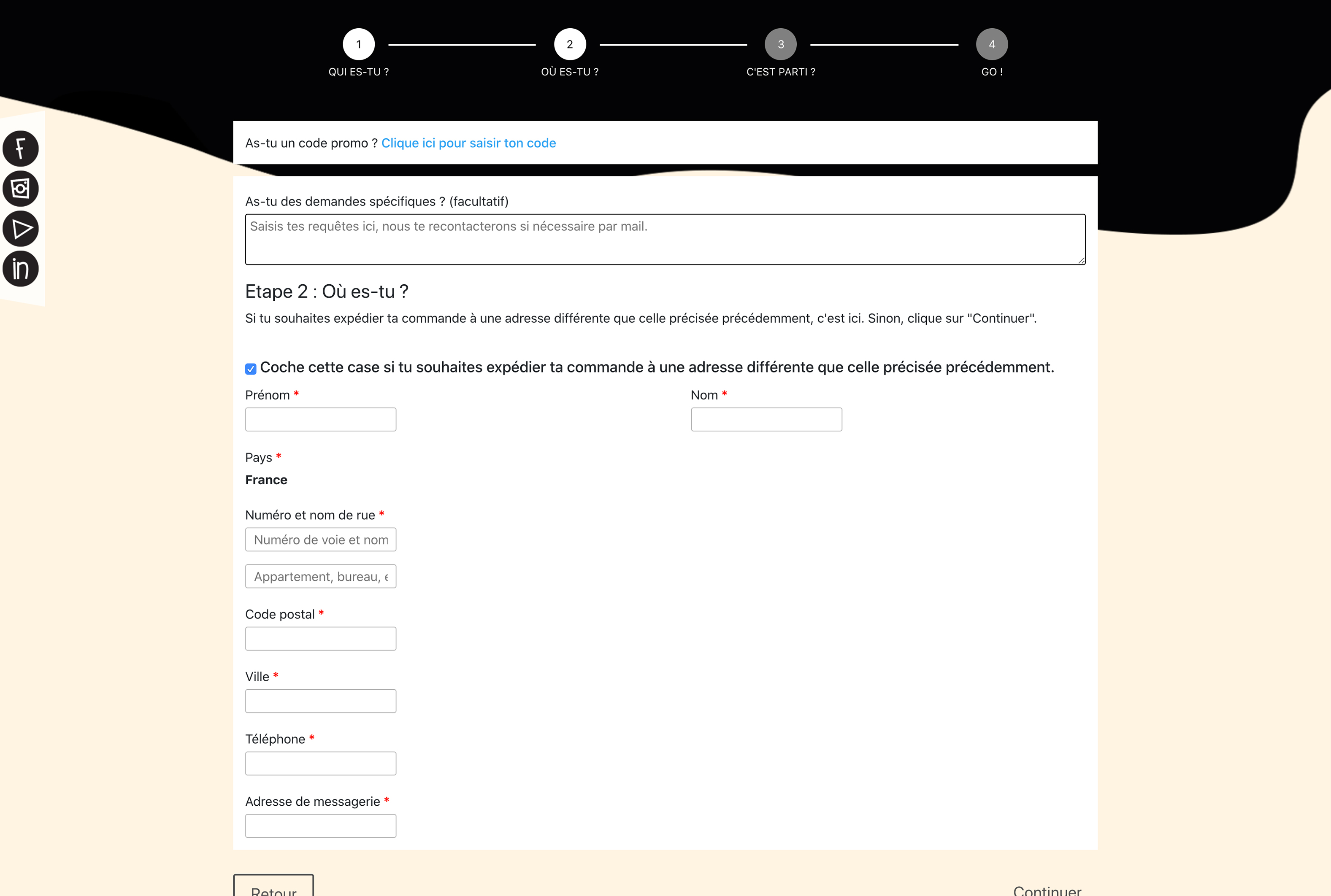
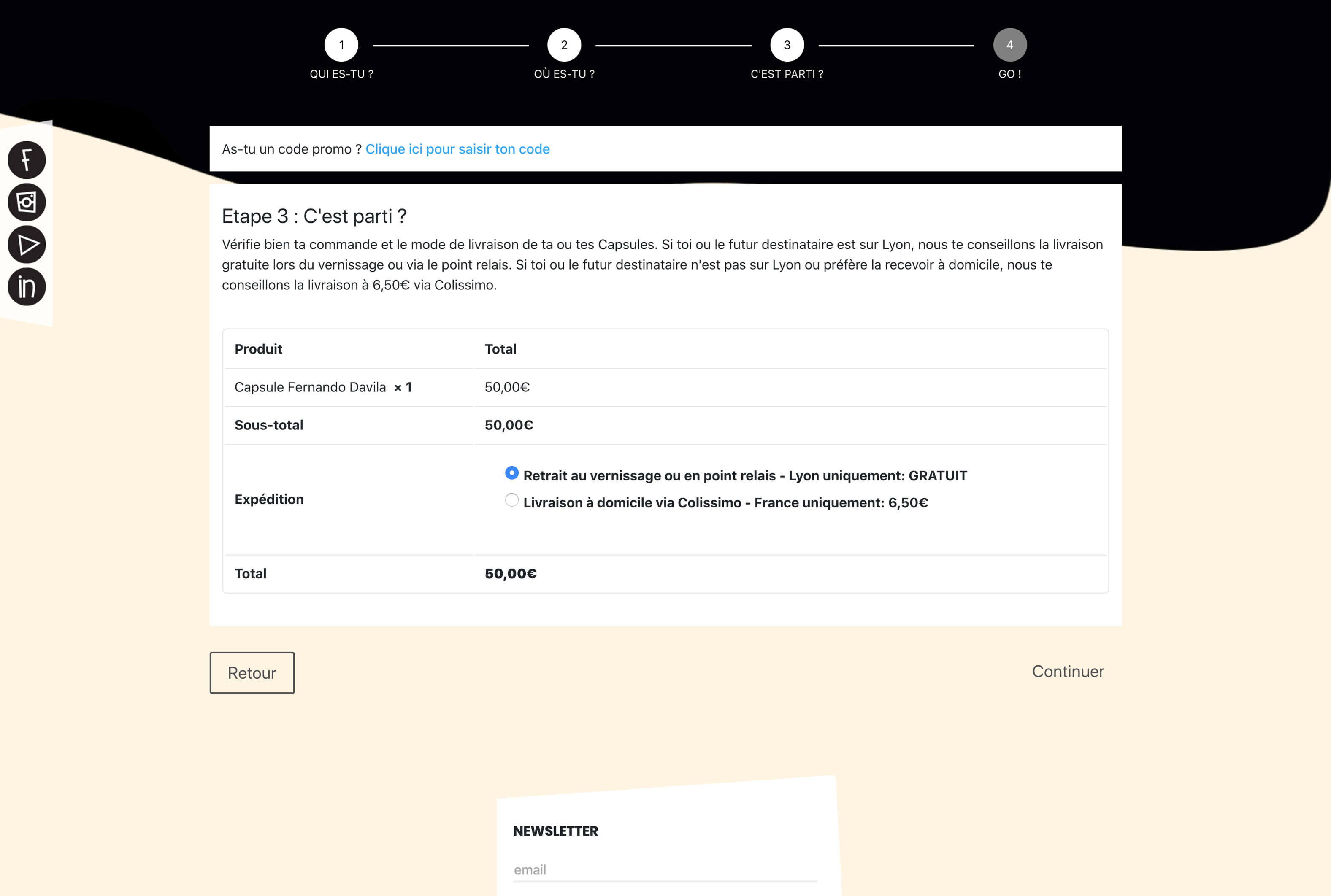
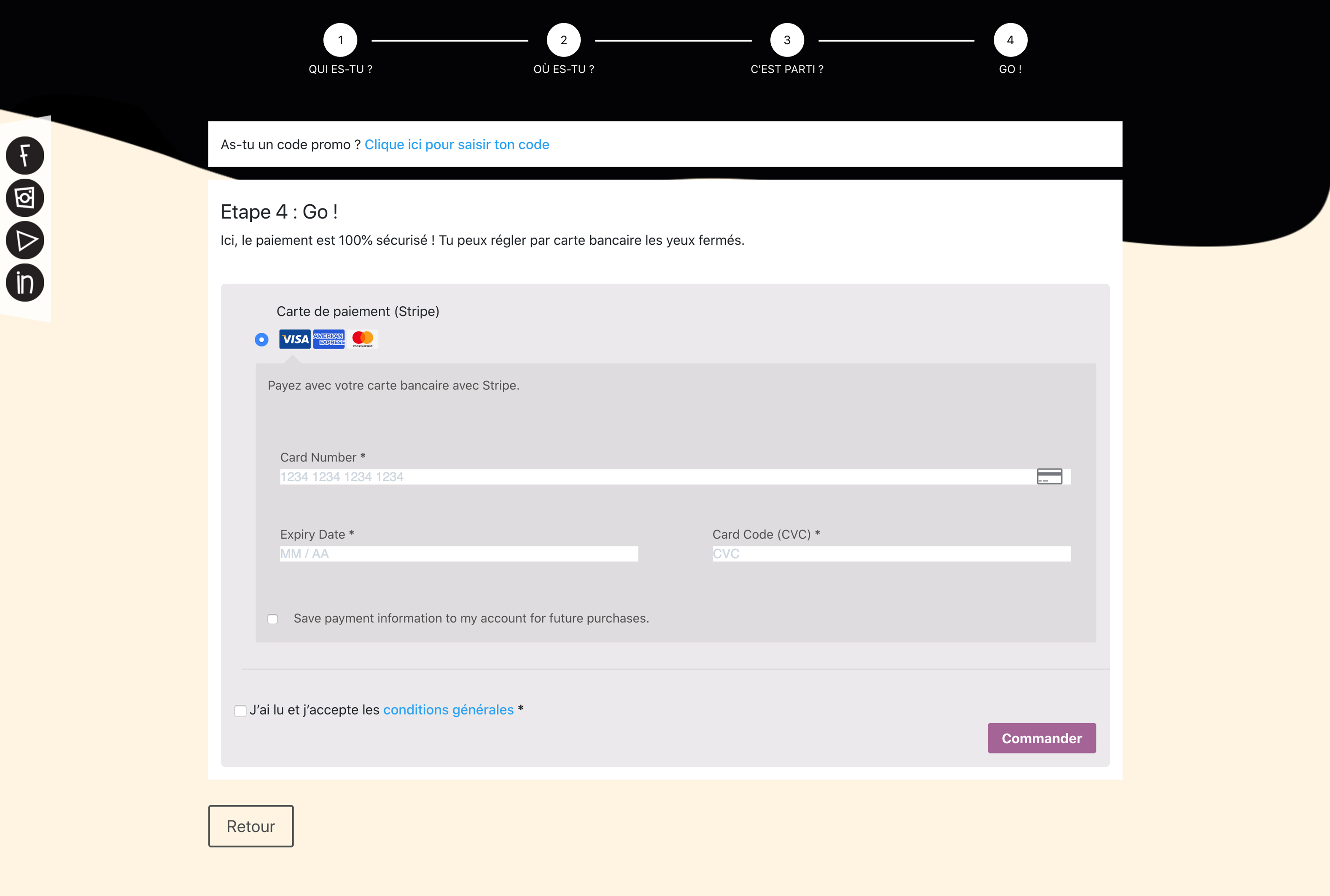
On this video, you can see our solution to help Maxime pays his order in 2 steps:
Usability testing
To ensure that the solution we provide is understandable by our users and meets their expectations, we conducted several usability tests. And we noticed that:
- 100% like the new navigation bar
- Love the idea to put more images
- Merge the 2 pages may complexify
Iteration
The mid-fi version can sometimes influence what users think. We will iterate by switching to the hi-fi version in order to better perceive whether or not users understand the changes.
To stay consistent and to respect the brand identity, we create a style tile that allows us to work in the same direction.
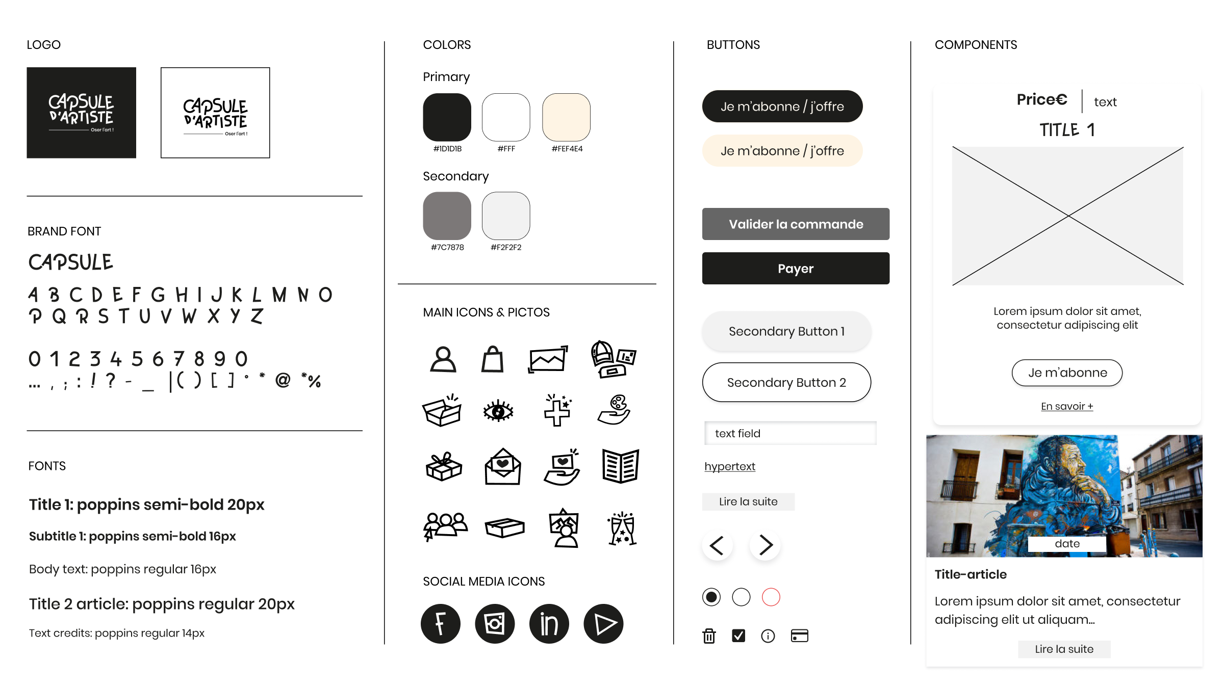
Hi-fi version
Desirability test
To be sure that we will not have to change the brand identity of Capsule d’Artiste, we still performed a desirability testing to see if the image fits with users. Below are the results:
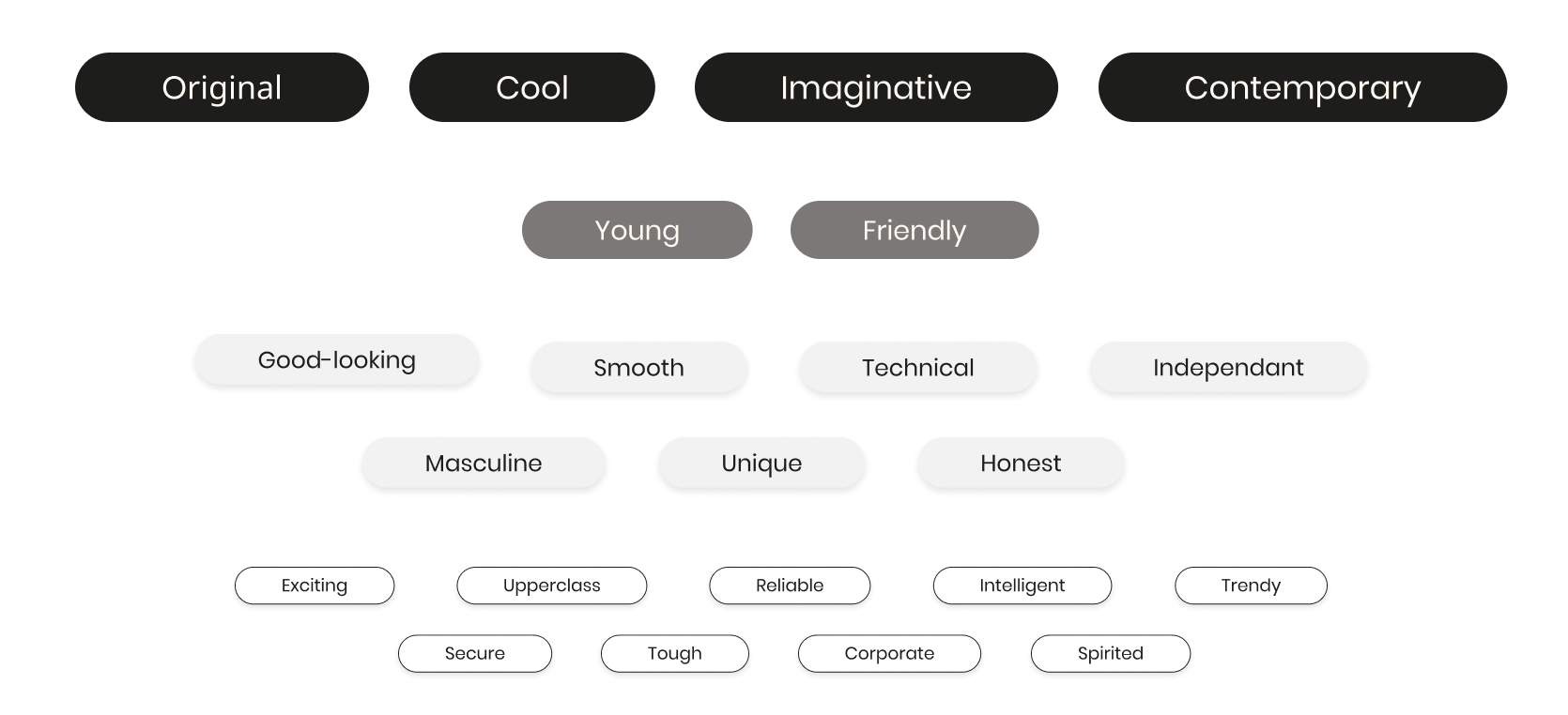
The majority think that it is original, cool, imaginative, contemporary, and also young and friendly. These are the feelings that Capsule d’Artiste wants to give to their clients.
Usability test
To be sure that the website is enough usable for users, we conducted other tests, and this time we want to make sure that they use our new buttons. So we use a heatmap to detect where users clicked and go.
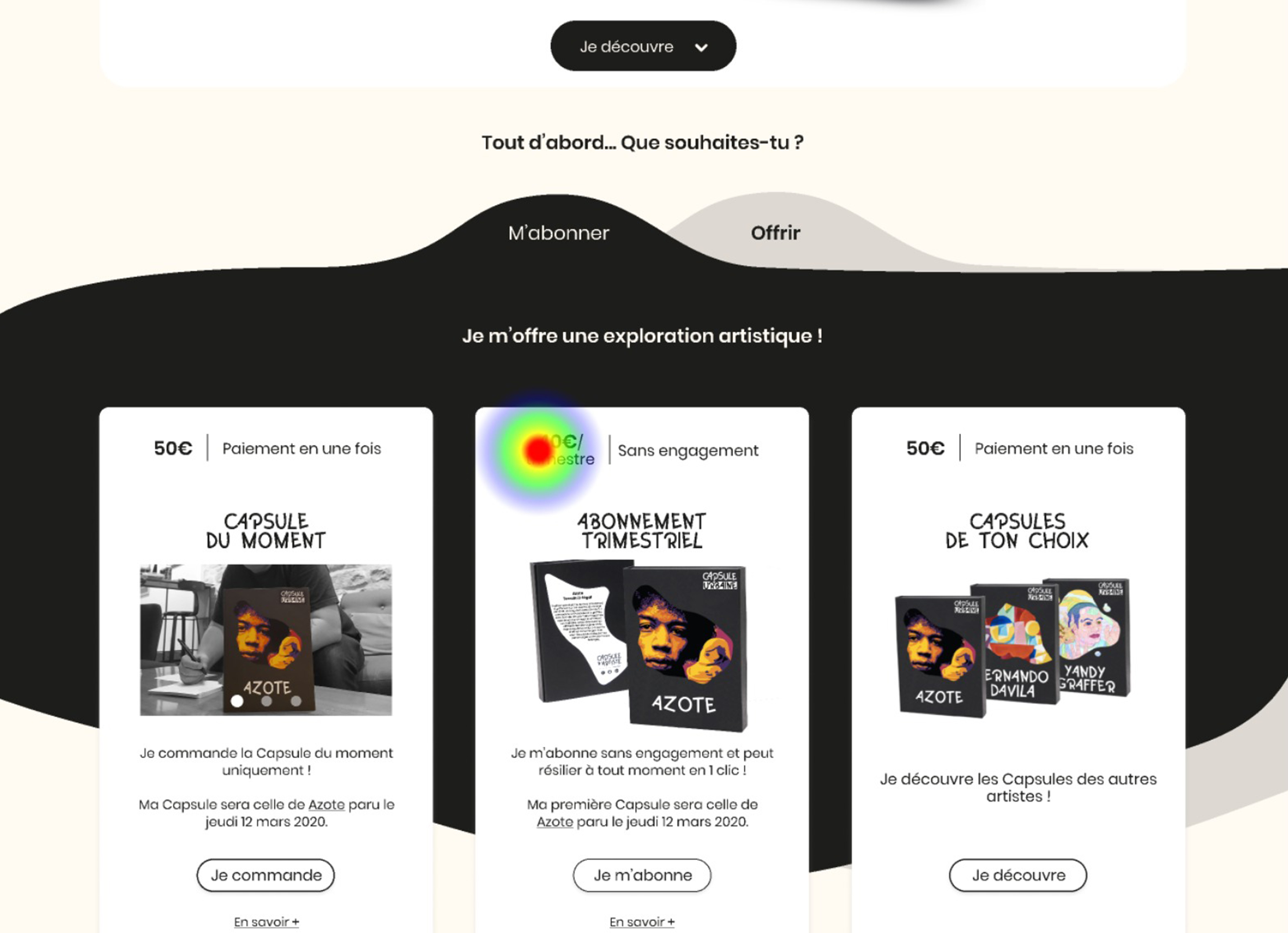
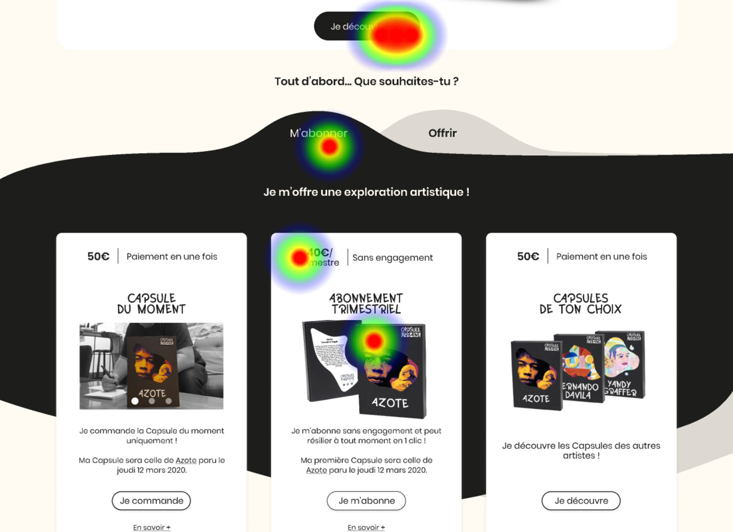
We observed that users like to click on prices and on pictures but not necessarily on the C.T.A., we can imagine subsequently making the whole element more clickable rather than a single call-to-action.
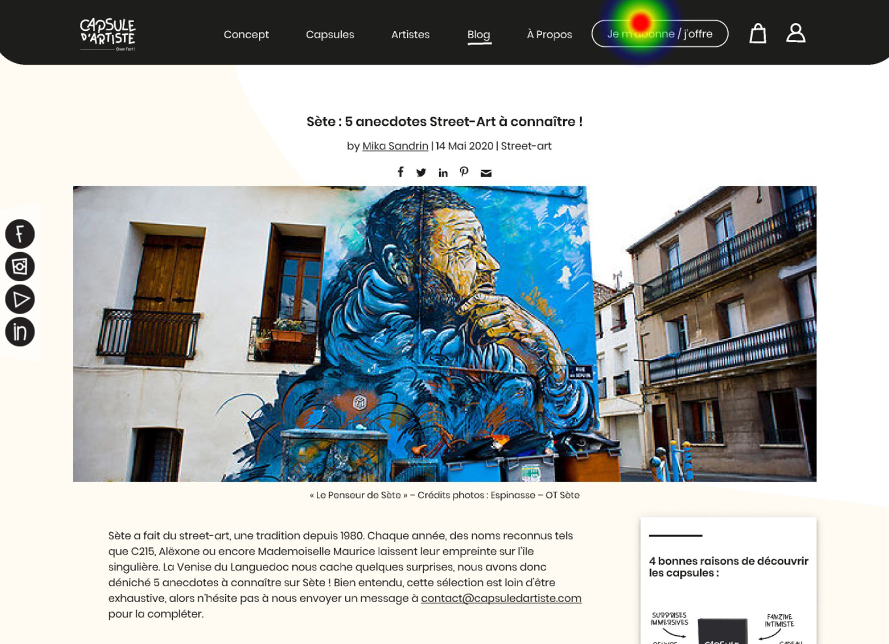
For the article page, we also noticed that 50% of users click on the new C.T.A. “je m’abonne/j’offre” on the navbar and 50% on the sticky block, which explains that our new button works.
Key learnings
During this project, we learn that for:
- Product cards: it seems that users do not click on buttons but rather on objects
- Some users ask us why there is twice the button “payer” on the basket page? Maybe only one is enough
- The C.T.As to switch “m’abonner” & “offrir” are not enough clarity on the page, maybe we have to design it differently or to forget this idea.
- And the new button “je m’abonne/j’offre” works
Key metrics
After another iteration, we. will know that we will reach our goals if:
- We have a good exit rate on the shopping cart page
- The user bought and paid
- We will have 50% increase in the number of subscriptions
- The conversion funnel increase
Next steps
Our next step is to:
- Test the hi-fi prototype with micro-interactions
- Adaptative or responsive for mobile version
- Success page & information messages