From mobile to desktop device
The event
Paris Design Week is an international general public event with 10 days of the festival off in parallel with the Maison & Objet fair. With new concept stores, showcases, vernissages, boutiques to follow, creative meetings, festive events… For a design inspiration in the Capital.
Have you ever been on a mobile website looking for information but it was too small? I know that it can be frustrated and you want to run away from this website! But we don’t want to scare away our users, do we? This is why we must provide a solution by thinking first of all about mobile.
Simplify to optimize
My first step was to learn more about the website and to understand how it works, so I did a sitemap. You can see below the old one:

I noticed that some pages can be merged like quartiers page, participants page, and program page. Also, the information page, à propos page, and contacts page can be found on the same page. So I decided to simplify the site to optimize the navigation on the website, please discover below the new version:
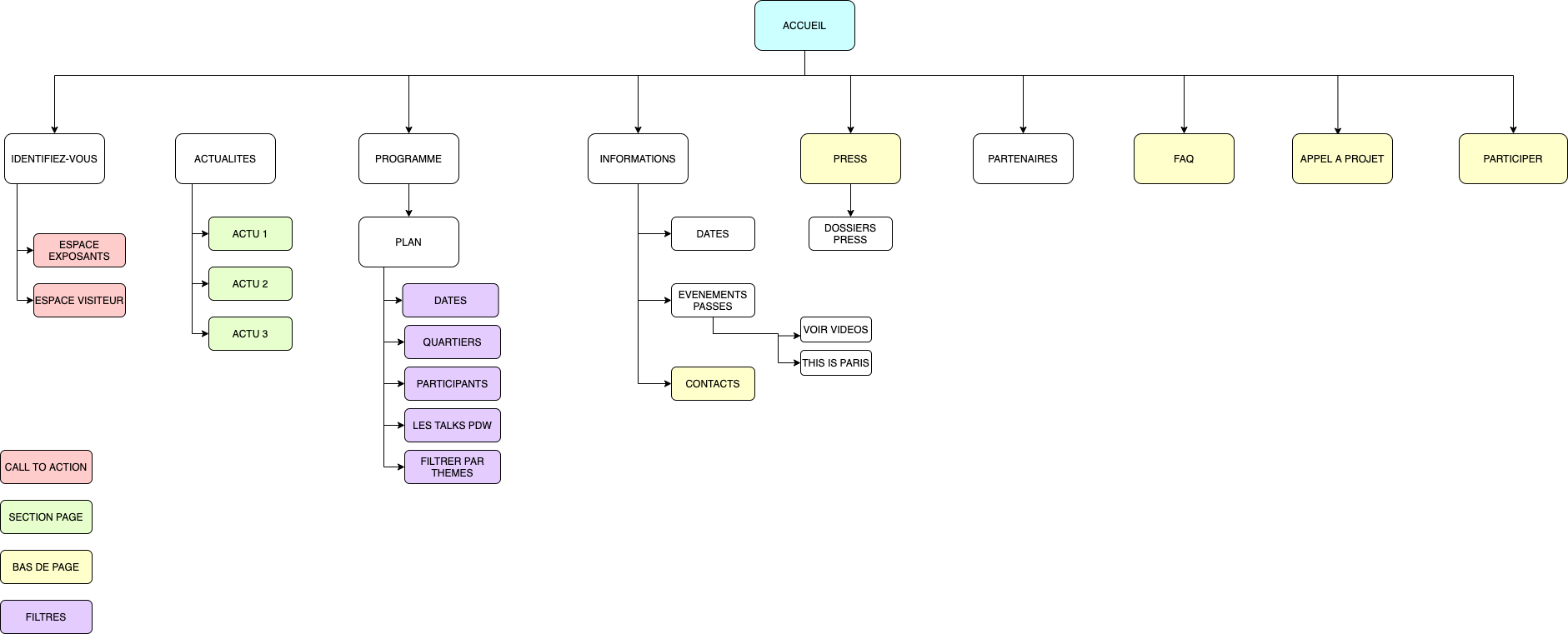
To have easier navigation and allow users to find information faster, I created a sticky search bar with filters. I also add a visitor space, so users can save their favorites and find them back later. Moreover, I want to create an interactive map, so it will be easier to see where expositions, talks, and participants are.
To best respond to the values we wish to convey:
Innovative, creative, social & prestigious
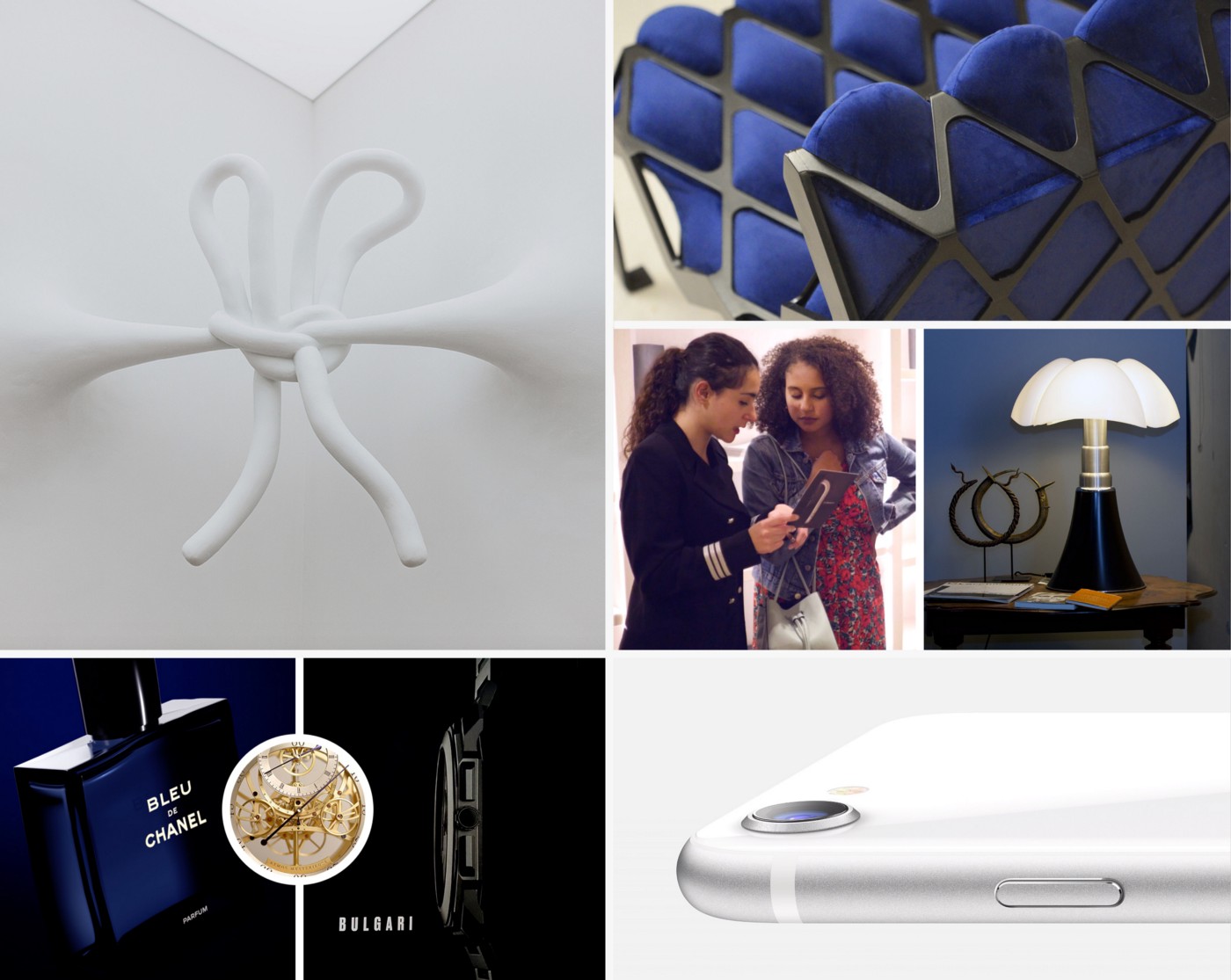
To reinforce our moodboard which can sometimes seem a little vague in the eyes of the customers and help to form a common visual language between the designers and the stakeholders, the style tile establishes a direct connection with the real interface elements without defining the layout.
While the word “mood” is often associated with branding and identity design, the word “style” has been chosen to reflect “cascading style sheets” and reinforce the fact that style tiles are specific to web design.
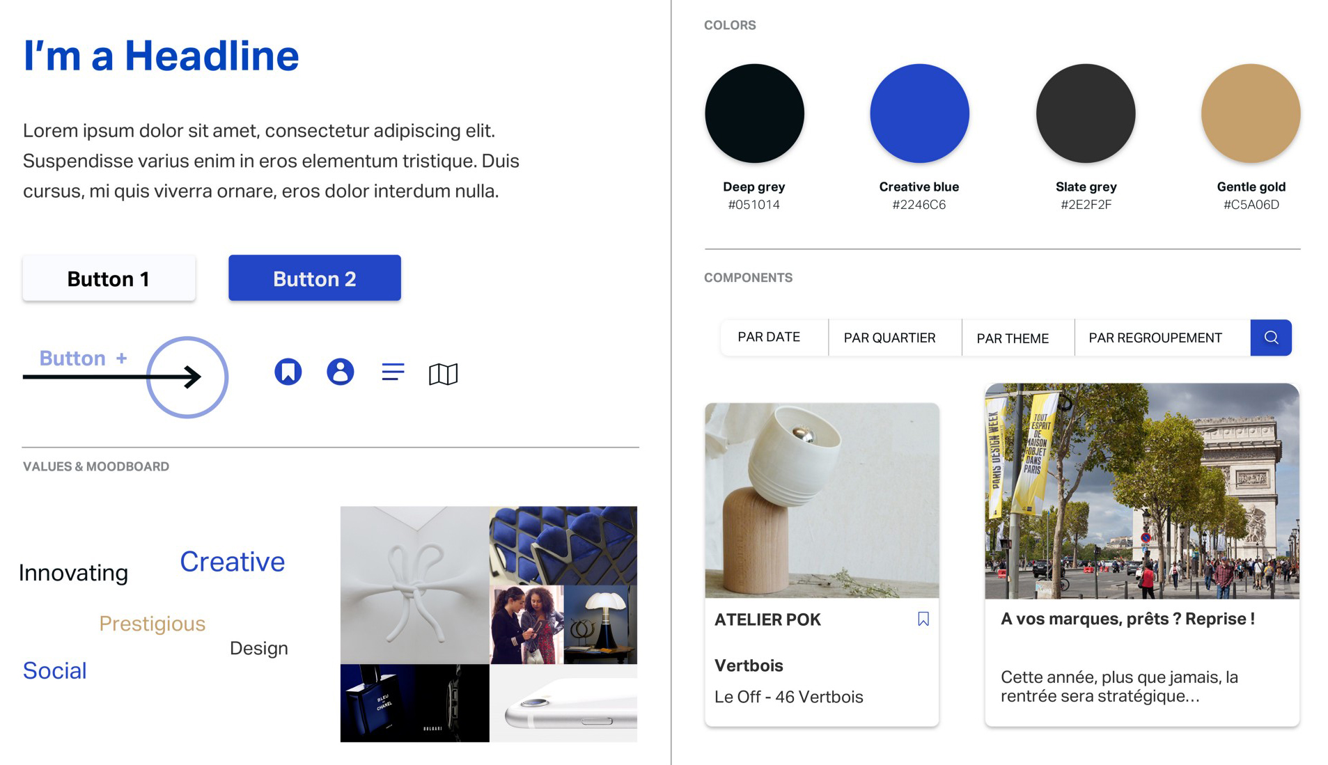
Style Tiles are a design deliverable made up of fonts, colors, and interface elements that communicate the essence of a visual brand for the web.
Mid-fi mobile prototype to hi-fi desktop version
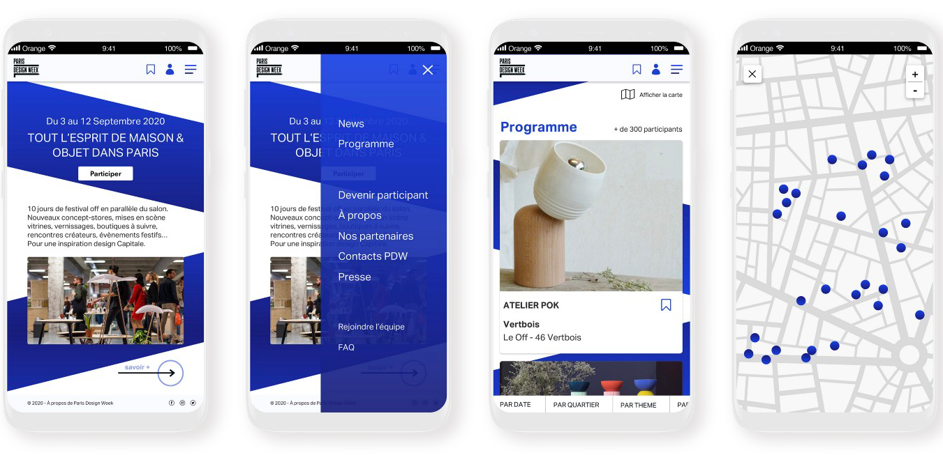
To begin, I created a wireflow with the mid-fi mobile version to think mobile-first. It can help us to think about all the elements, from smaller to bigger ones and the userflow. We wanted to focus here on the program page to show you each step to find a participant easier.
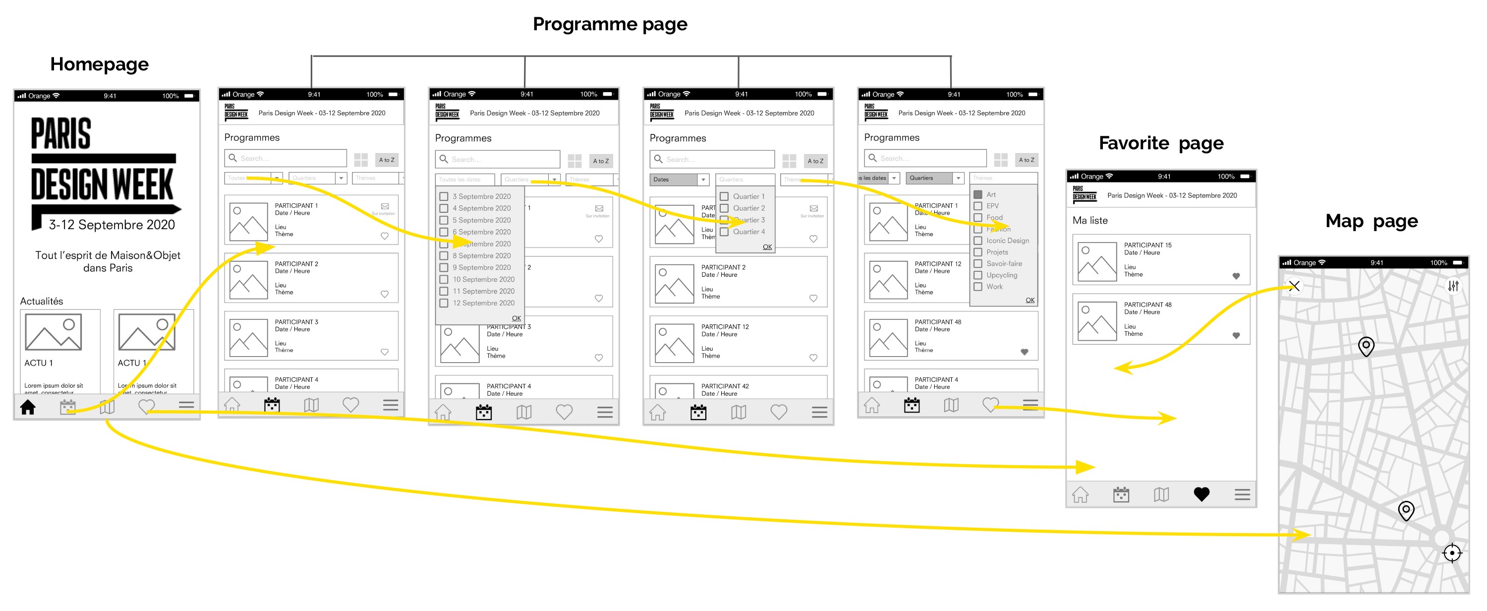
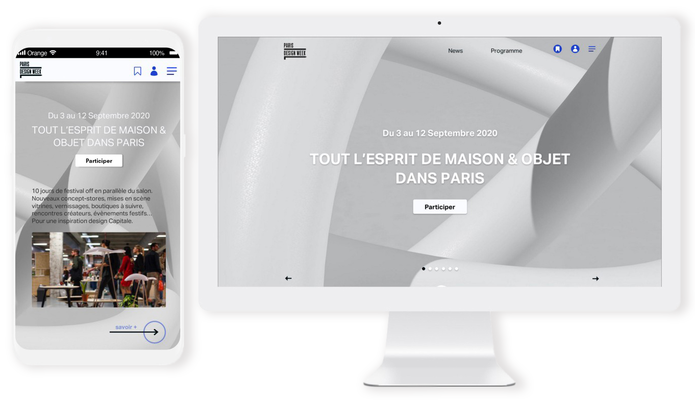
And now we mostly know how the new website works, we can create the hi-fi on the desktop version with the elements from the style tile:
And the adaptive version on mobile below with bigger text, images, and cards to have better readability:
But what about the user’s feelings?
To get a better idea of what users think, I conducted a desirability test to bring out our brand personality and see if it corresponds to what we want to convey.
The 5-second first impression test seems like a good way to see how users see our product. I asked 19 people and below are the results:
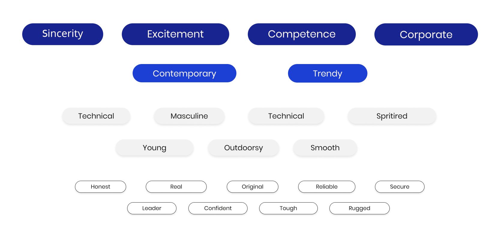
The majority thought that is was a website for a corporate company and it looked too masculine or rugged, but it also contemporary.
We want to create something more organic, simpler and fits with human feelings. So we think about a 3D shape, rounded and designed that we want to put on some part of the website.
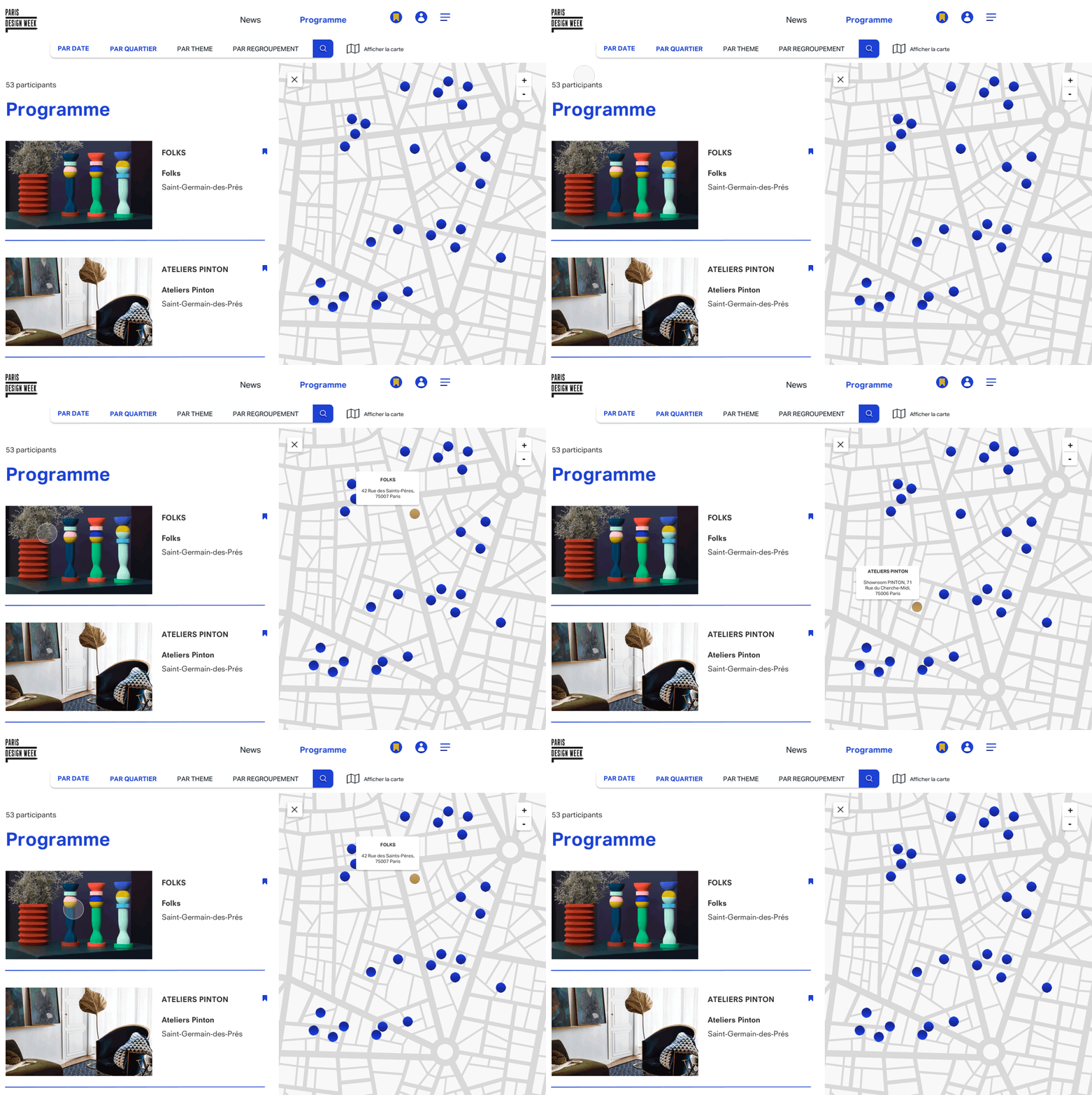
We have also created an interaction on the map to show how with the hover on the participating cart, the user can see the address directly and save it more easily on his favorite.
Key learnings & Next steps
With this project, we have learned that we have to think twice about the assertive colors and use them with moderation. There are different perceptions and interpretations of colors, people didn’t feel the same so we have to choose if we want or not to keep some elements and details to please them.
For the next steps, we want to do another brand personality test with the new version of the website that we proposed and see if it works and re-iterate if not.